There has been considerable debate concerning the economic impacts of divorce on the livelihoods of women. Duncan and Hoffman (1988) state that, “the economic status of women fell an average of about 30 percent in the first year after divorce”(Duncan and Hoffman 1988, 641). However, others note that a negatively causal relationship between divorce and the economic well being of women is difficult to prove, as women who experience divorce often differ in ways that are difficult to measure (Holden and Smock 1991; Smock, Manning, and Gupta 1999). Important to note is the well-documented increase in the labor force participation of mothers throughout the 20th century (Shapiro and Mott, 1978; Shapiro and Mott, 1994). Considering this trend, this post will address the effects of divorce and childbirth on the economic well being of a subset of the population: those in the labor force. By examining the relationship between marital status, number of children, and wage income, I hope to achieve a greater understanding of the impact that divorce has on the wage incomes of this smaller subset.
Data:
I collected my data for this analysis from the Integrated Public Use Microdata Series (IPUMS). I used sample data from 1940 to 2010. I used 1% samples for 1940 to 1960, 1990, and 2000. I used the 1% State Form 1 sample for 1970; the 1% Metro sample for 1980, and the 1% American Community Study(ACS) for 2010. The US Census Bureau administers the ACS. I used the variables MARST, NCHILD, EMPSTAT, and INCWAGE for my analysis. The MARST variable gives describes each respondent’s marital status at the time of the census. The possible outcomes for the MARST variable are ‘Married, spouse present’, ‘Married, spouse absent’, ‘Separated’, ‘Divorced’, ‘Widowed’, and ‘Never Married/Single’. The NCHILD variable describes the number of own children living with each individual, including biological children, stepchildren, and adopted children. The EMPSTAT variable indicates whether the respondent is employed, unemployed, or not in the labor force. The INCWAGE variable indicates the total pre-tax wage and salary income for each individual for the previous year; for the census, this was the previous calendar year, for the ACS, this included the previous 12 months.
All of the following analyses are weighted by the PERWT variable for all years excluding 1950, and weighted by the SLWT variable for 1950.
Method:
I began my analysis by excluding respondents who were reported as ‘Never Married/Single’ (MARST==6). Next, in order to simplify my definition of married within the data, I decided to combine respondents who were recorded as ‘Married, spouse absent’ (MARST==2) with those who were recorded as ‘Married, spouse present’ (MARST==1) to make a single category labeled ‘Married’. I decided to limit my analysis to respondents with at least 1 child (NCHILD>=1), and top coded the number of children to 6. I created categories for the NCHILD variable simply labeled ‘1’, ‘2’, ‘3’, ‘4’, ‘5’, ‘6+’. I limited my analysis to individuals reported as employed in the labor force (EMPSTAT == 1). Finally I adjusted the wage incomes reported by the INCWAGE variable for inflation by using the Consumer Price Index (CPI) to find the multiple for each sample year and converting all dollars to the 2010 level. After manipulating the data in these ways, I created a plot comparing the inflation adjusted wage incomes across the relevant marital statuses and sex; a plot comparing the number of children in custody across sex and between divorced and married respondents; and a plot comparing the inflation adjusted wage incomes across sex and between divorced and married respondents. My R code for the analysis can be found here.
Results:
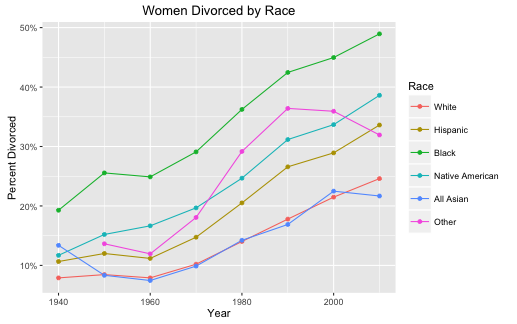
Figure 1:
Figure 1 shows the median inflation adjusted wage incomes for fathers and mothers across the examined marital statuses. First, it is important to recognize the far gap between the median inflation adjusted incomes for fathers and mothers, representing the consistent gender pay gap present in the United States throughout history. Yet, there is a gradual lessening of the gap as time approaches the present day. Next, seen here is a steep increase in inflation adjusted wage incomes across all cohorts between 1940 and 1970. For fathers, this trend is followed by a drastic plateauing across all marital statuses. For mothers, the subsequent trend differs across the various marital statuses. For divorced mothers, there is a slight decline in the median wage income between 1970 and 1980, followed by a tapering rate of increase between 1980 and 2010. For married mothers, there is a similar slight decrease in median wage incomes between 1970 and 1980, followed by another period of high rates of increase between 1980 and 2010. Widowed mothers in the workforce also experience a slight decrease in median wage income between 1970 and 1980, followed by a lackluster increase between 1980 and 2010. Separated mothers experience a consistent increase in median wage income until 2000, followed by a decrease in 2010.
Possibly the most interesting trend examined in this plot is the difference in differences between divorced and married fathers and mothers. Across all years examined, married fathers have had consistently higher inflation adjusted wage incomes than divorced fathers. However, divorced mothers have experienced notable higher inflation adjusted wage incomes than married mothers, until only recently. In 2010, we see a convergence of the median wage incomes for both married and divorced mothers for the first time, suggesting a possible current reversal in this consistent historical trend.
Figure 2:
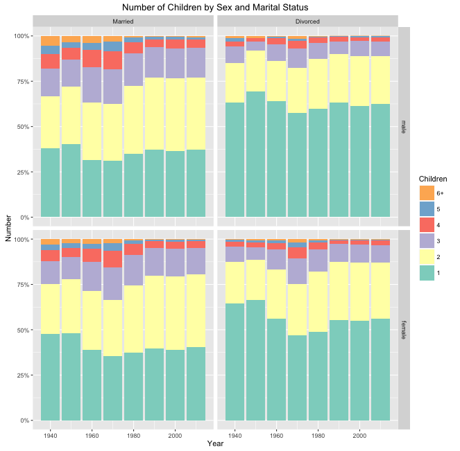
Figure 3:
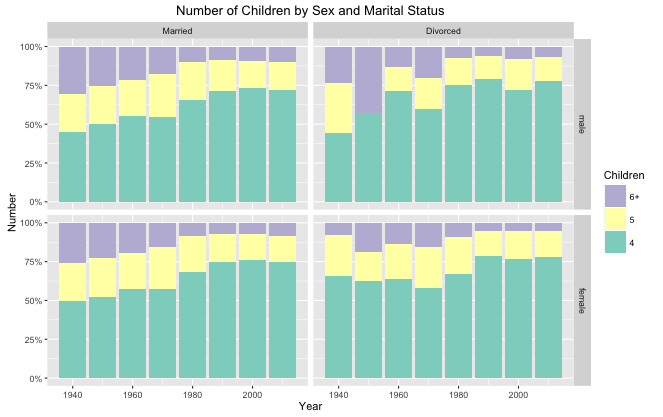
Figure 2 shows the distributions of number of children across divorced and married mothers and fathers. Seen here are similar trends in the number of children for married men and women as well as divorced men and women. Seen during the baby boom is a general increase in number of children across all cohorts, followed by a steady decrease between 1970 and 2010.
Figure 3 shows a magnified plot of the percentage of divorced and married mothers and fathers with 4, 5, and 6+ children. Again, similar trends are examined across all cohorts. However, it seems there may be a coding error in the percentage of divorced fathers with 5 children in 1950. Furthermore, divorced fathers are examined to have custody over a slightly higher percentage of the high-numbers groups of children.
Figure 4:
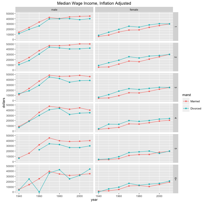
Figure 4 shows the median inflation adjusted wage incomes for divorced and married mothers and fathers across cohorts of number of custodial children. Seen here is a sustained consistency in the difference in median wage incomes between divorced and married mothers and fathers, despite the increase in number of custodial children. There is a perceived gradual increase in the difference in median wage income for divorced men as the number of children increases, until the ‘6+’ category; the high variance in this category may point to a low number of male respondents in the samples who are divorced and have 6 or greater children in their custody.
Furthermore, there seems to be greater downward pressure on the median income of divorced fathers than divorced mothers as the number of children increases. This downward pressure is seen gradually as the number of children increases, but most drastically when the number of children in custody reaches 5. Although there may be slight downward pressure on difference in median wage income between divorced and married women, the magnitude seems to be less so than that for fathers.
Conclusion:
The median wage incomes of divorced fathers with child custody are effected greater as the number of children in custody increases than the median wage incomes for divorced mothers with child custody. Furthermore, median inflation adjusted incomes for divorced mothers have been consistently greater than the median inflation adjusted incomes for married mothers. This trend is contrary to some of the literature, suggesting that, by the metric of wage income, divorced mothers may have an advantage over married mothers. However, this does not disprove a decrease in economic status post divorce (Duncan and Hoffman, 1988), as the median wage incomes for fathers are still far higher than those for mothers. Finally, there has been a recent convergence in the median inflation adjusted incomes for divorced and married mothers across all cohorts, suggesting a reversal of the consistent trend.
Works Cited:
Shapiro, David, and Frank L. Mott. “Long-Term Employment and Earnings of Womenin Relation to Employment Behavior Surrounding the First Birth.” The Journal of Human Resources 29.2 (1994): 248. Web.
Shapiro, David, and Frank L. Mott. “Labor Supply Behavior of Prospective andNew Mothers.” Demography 16.2 (1979): 199. Web.
Tienda, Marta, and Jennifer Glass. “Household Structure and Labor ForceParticipation of Black, Hispanic, and White Mothers.” Demography 22.3(1985): 381. Web.
Hoffman, Saul D., and Greg J. Duncan. “What Are the Economic Consequences of Divorce?” Demography 25.4 (1988): 641. Web.
Bedard, Kelly, and Olivier Deschênes. “Sex Preferences, Marital Dissolution, and the Economic Status of Women.” Journal of Human Resources J. Human Resources XL.2 (2005): 411-34. Web.