
I) Introduction
Scholars have differing opinions on the causes of and outcomes from the rising labor force participation of wives in the United States during the 20th century. Some attribute the rise to pressure on married women to increase their families standard of living. Others attribute the rise to shifting gender norms encouraging women to work. Using IPUMS data, I will test scholars arguments regarding the causes of, and the outcomes that came from the rising labor force participation of married women in the United States.
First, I will test Bee-Lan Wang’s assertion that mothers joined the labor force due to a rising opportunity cost for being stay at home moms. In other words, she argued that there were greater incentives and drawbacks to staying at home, and not joining the paid labor force. Specifically, Bee-Lan Wang argued that married women were not encouraged to work “in order to avoid poverty” (22). Instead, they were motivated to work so that they could increase their families’ standard of living, to live a more affluent lifestyle (Wang 22).
Taking this a step further, Diane Macunovich argued that wages for jobs available to younger males in the 1970s were driven down by an increasing relative cohort size: the ratio of workers aged 45-54 to workers aged 20-24 (634-35). Thus, younger married couples, aged 20-24, in male breadwinner households had significantly lower incomes than the households they grew up in. Women were encouraged to work in order to maintain the same standard of living as they experienced growing up (Macunovich 2012).
In order to determine the extent to which married women went to worked in order to raise or maintain their standard of living, it is essential to examine the income distribution of families with two bread winners, versus only one male or female breadwinner. If dual breadwinners make significantly more than male breadwinners, it is likely that women were encouraged to work in order to match or increase the standard of living.
Next, I will evaluate Coontz’s assertion in “The Way We Never Were,” that the rising labor force participation of wives could mostly be attributed to the rising significance of 2nd wave feminism (163). Specifically, Coontz argues that the movement had a significant impact on the workforce participation of educated women in the 1960s. In order to verify her claims, I will visualize the workforce participation rates of women with different educational backgrounds.
Lastly, I will examine the relationship between income inequality and female labor force participation. In “Changing Female Labor Force Participation: Influences of Income Inequality and Distribution,” Nan Maxwell argues that income inequality between 1940 and 1970 was reduced as married women, with husbands who made low incomes, went to work (Maxwell, 1252). However, after 1970, the increase in female labor force participation came from the most affluent households, contributing to rising income inequality (Maxwell, 1252). In order to evaluate these claims, I will make and examine a boxplot showing the household incomes distribution for different breadwinner models from 1960 to 2000.
All together my visualizations will span across four units of analysis: Gender, Family, Work, and Education. In examining claims made by scholars, I will attempt to answer several research questions. First, to what extent did married women enter the paid labor force between 1940 and 2000? Second, what are the differences in income for different breadwinner models? If there are substantial differences, how might this have played a role in the labor force participation of married women? Third, what is the nature of the relationship between income inequality and married women’s labor force participation in the United States? Finally, were women with higher levels of education more likely to enter the workforce? And if so, when were they most likely to enter?
II) Data and Methods
Data for all figures was gathered from 1% IPUMS samples between 1940 and 2000. It is important to note that data from 1970 and 1980 were gathered from, respectively, 1% Metro and 1% State Form 1 samples. Furthermore, I filtered out all data from Alaska and Hawaii before 1960, because the data collected from these states in 1950 and 1950 are not present in the IPUMS samples. Lastly, the data only included data from traditional household group quarters, excluding large institutions such as prisons, psych wards, and halfway houses.
Figure 1 shows the ratio of working to non-working wives between 1940 and 2000. Figure 2 shows the total number of working to non-working wives between 1940 and 2000. The data for these figures were weighted with the PERWT variable. The ‘Not Working’ category was created with the OCC1950 variable, and included all people without paid employment, including the unemployed searching for work. The working category included all people in the OCC1950 variable who were recorded as having paid employment.
Figure 3 shows the median household incomes for male breadwinner (one working male), female breadwinner (one working female), and dual breadwinner (working male and female) households, from 1960 to 2000. The income variable (INCWAGE) was weighted to adjust for inflation with the CPI99 variable. So, the income’s for all years are equivalent what they could have been during 1999 price levels. Furthermore, it is important to note that INCWAGE shows the income of a single person one year before the census. The household’s incomes were calculated by combining the income of both spouses. In this case, the household income variable was weighted with the HHWT variable.
Figure 4 graph is a box plot measuring the distribution of household incomes for male breadwinner, female breadwinner, and dual breadwinner households, also from 1960 to 2000. The bottom line starts at the 10th percentile of household income. The bottom, middle, and top of the box are set to, respectively, the 25 percentile, the median, and the 75th percentile. Lastly, the top of the line extending out of the box ends at the 90th percentile of household income.
Figure 5 is a bar graph that shows the total number of non working and working married women, segmented by the married women’s level of education attainment, from 1960 to 2000. The education variable was constructed by splitting the sample into groups based on the number of years of education they had received. Finally, Figure 6 is a line graph that shows the percentage of working to non-working wives with different levels of education, from 1960 to 2000.
To view the code click here.
III) Data Visualizations
a) Wives Labor Force Participation
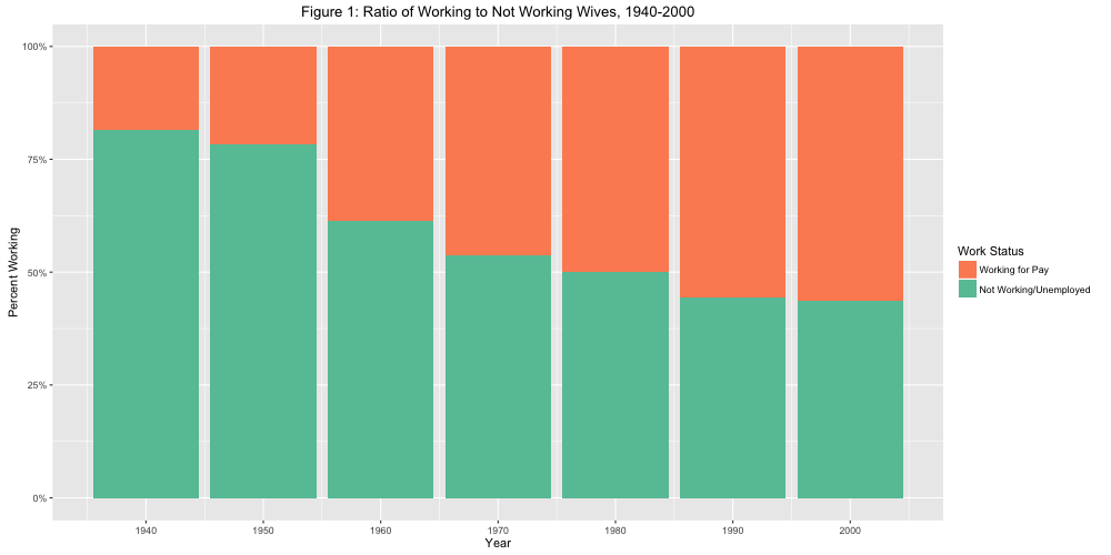
The first figure shows a consistently rising ratio of working married women to not working married women. The most notable increase in workforce participation is between 1950 to 1960, where the percent of wives working for pay rises from 21.66% to 38.7%.
For most, reflecting on the 1950’s leads one to conjure up images of popular television shows, such as Leave it to Beaver, that reinforce a cult of domesticity. However, it seems that this was actually an era of empowerment, as millions of married women flooded into the workforce. Coontz attributes the growth of married women’s employment in the 1950’s to the growth of industries that employed mostly women. Specifically, industries such as “clerical work, teaching, nursing, and retail sales … [grew rapidly] after the second world war” and into the 1950’s (Coontz 161). As the demand for and price of women’s labor increased, more married women entered the paid labor force. Additionally, Coontz argues that while the G.I. Bill did subsidize college for returning veterans, the funding provided was not enough to sustain a middle class family lifestyle. Thus, many women married to vets attending college on the G.I. Bill needed to work to support their families.
Both of Coontz explanations for the increase labor force participation are compelling. However, Figure 1 and Figure 2 only prove that there was a drastic rise in labor force participation in the 1950’s. Qualitative data, such as interviews of married women in the 1950’s, is required to evaluate why there was an increased labor force participation of married women.
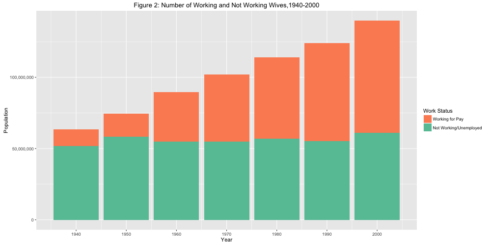
The second figure visualizes the total number of non-working and working married women decade by decade. Interestingly, the number of married women who do not work remains fairly constant. In fact, it rises from 51,765,315 in 1940 to 61,124,956 in 2000. However, the number of working married women rises from 11,703,448 in 1940 to 78,751,146 in 2000. This rise is significantly higher than the rise of non working married women. This suggests that the increased number of married women who work for pay can be partially attributed to population growth.
Overall, the findings from Figures 1 and 2 are consistent with Bee-Lan Wang’s assertions in “The Working Mother,” and Stephanie Coontz’ declarations in “The Way We Never Were” that there was a rise in mothers labor force participation.
b) Income for Dual, Male, and Female Breadwinner Households
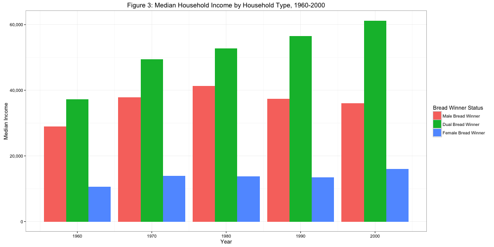
The third figure examines the relationship between breadwinner models (male, female, and dual), and median household income. As we can see male breadwinners, on average, have significantly higher incomes than female breadwinners. Furthermore, it is likely that male breadwinners tend to make higher incomes than men or women in dual bread winner households. This is especially true between 1960-1980 because male breadwinner households, with just one paycheck, had only a slightly lower median income than dual breadwinner households, with two paychecks. But, after 1970, the incomes of single male breadwinners decline. Moreover, between 1960 and 2000, the weighted income of dual bread winner households consistently rise from decade to decade.
These findings support Bee-Lan Wang argument that, “the main incentive [for wives to work] is the additional degree of financial freedom that a second income provides” ( Given the larger incomes of dual breadwinner households, and their increasing prevalence, wives seems to have been partially motivated to join the labor force to raise their families spending power and standard of living.
Furthermore, the clear decline in the median income of male breadwinner households after 1970 suggests that younger married women were encouraged to go to work as their male partners made less income than their fathers had in the past. While this data does reinforce Macunovich’s claims, it does not examine the distribution by age bracket, making it difficult to prove her argument to be, without a doubt, true.
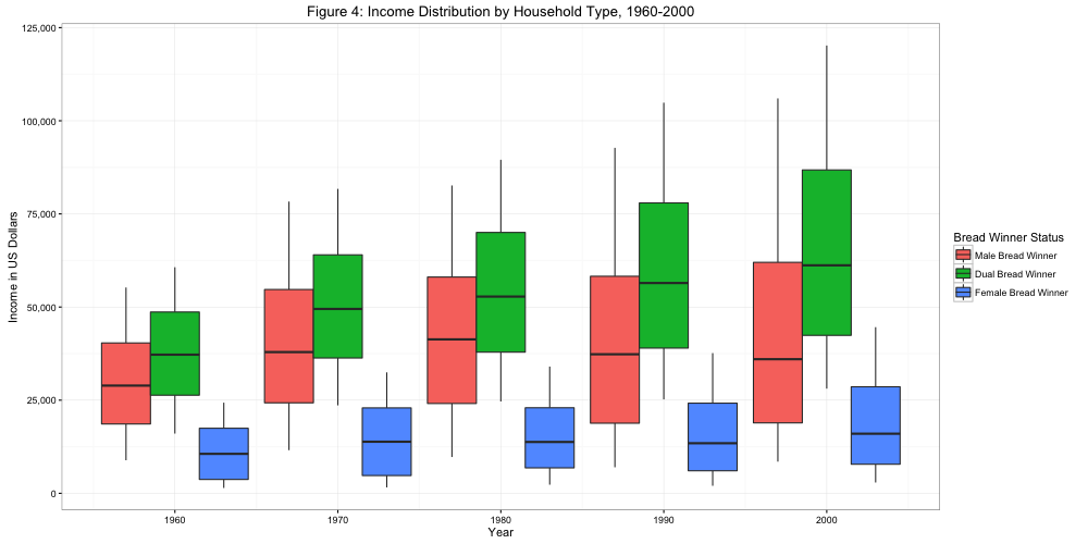
Next, figure four shows the distribution of household income for different breadwinner models between 1940 and 2000. First, it is notable that female breadwinner households have much smaller spans, and are concentrated towards the bottom of the distribution. Thus, it follows that the majority of these households have significantly lower incomes than other breadwinner models.
Interestingly, the bottom 10th percentile of household incomes for dual breadwinners does increase slightly from 1960 to 1970. But, the 90th percentile increases by much more, suggesting higher proportions of wealth flooding into the top income brackets. This contradicts Maxwell’s argument that the rise in dual breadwinner households before 1970 contributed to lower levels of income inequality.
The 90th percentile of dual breadwinner household’s income increases drastically from 1970 to 2000. This finding, actually reinforces Maxwell’s claim that the rise in dual bread winner household’s after 1970 contributed to larger amounts of inequality. Specifically, household income inequality increased because most women who went to work during this time period had husbands who already made high incomes. These women had high earning potential because people tend to marry others from the same social class, with comparable levels of education, and earning potential (Burdett, 141).
Nonetheless, it is important to note that there are many potential explanations for the distribution of income in the United States between 1960 and 2000. There is no way to determine whether there is any causational relationship between income inequality and married women’s labor force participation from Figure 4 alone. Higher rates of wives’ labor force participation only correlate with more income inequality.
c) The Role of Education in Wives Labor Participation
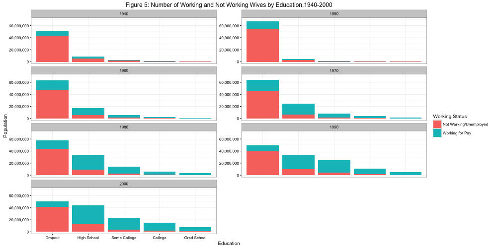
The fifth figure shows the number of women with different levels of education, distributed between women in each group who work for pay, and those who do not, from 1940 to 2000. Here, we see that in each decade, the largest group is women who did not graduate high school. However, there are significant improvements in women’s levels of education. Most notable is the increase in high school graduates from 8,743,107 in 1940 to 43,545,881 in 2000. This group played a crucial role in the increasing labor force participation of married women, as the number of working high school graduates increased consistently from year to year. The number of married women who go on to complete some college, college, and graduate school also increased. While these groups were smaller than the first two, they also had consistently higher ratios of working to non working married women.
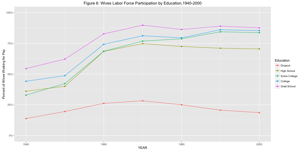
The sixth figure shows the labor force participation rate of married women with different levels of education from 1940 to 2000. Interestingly, there is a stark disparity between the labor force participation of married women who did not graduate high school, and women who graduated high school and beyond. Specifically, married women who did not finish high school were far less likely to participate in the paid labor force than married women who did. Among married women who did graduate high school, there was a persistent positive relationship between the number of years of education they received after high school, and the likelihood that they would enter the paid labor force.
Notebly, the sixth figure shows a steep increase in educated, married women’s labor force participation from 1950 to 1960. In “The Way We Never Were” Stephanie Coontz argues that the 1960s feminist movement, usually referred to as second wave feminism, succeeded in establishing social norms encouraging educated married women to go to work. The rise in educated women’s labor force participation from 1950 to 1960 challenges this assertion, as it occurred before the emergence of the second wave of feminism. In fact, it seems that 2nd wave feminism was more of a reflection of increasing numbers of educated women entering the labor force, rather than a catalyst for the change.
5) Conclusion
The number of working wives increased drastically from 1940 to 2000. In 1940, there were 11,703,448 married women who worked for pay, who represented 18.4% percent of all married women. By 2000, there were 78,471,643 total, representing 55.92% percent. This finding fits in well with scholars assertions that married women flooded into the paid labor force during the 20th century.
Furthermore, census data supports the notion that women were encouraged to go to work in order to increase their household’s income. Dual breadwinner households had consistently higher, and faster rising incomes compared to male breadwinner households. Clearly, when married women went to work, they increased their households spending power.
Lastly, it does not seem that 1960s pro work feminist movement played a significant role in encouraging educated women to go to work. The majority of educated women entered the workforce between 1950 and 1960. After 1960, the slope of the workforce participation line of educated women decreases, signalling a lull in their entry into the workforce.
Overall, the figures do a great job at showing what is happening with regards married women’s labor force participation, and the incomes of different breadwinner models. However, it proves difficult to determine the causes of and outcomes from the visualizations. It is important to be cautious when making causational claim’s using evidence gathered from Census Data. Instead, Census Data is best used to back up or disprove existing theories, to show correlations between two variables, and to paint a picture of social life in the United States.
6) References
Burdett, Ken and Melvyn Coles. 1997. “Marriage and Class.” The Quarterly Journal of Economics 112(1): 141-168.
Coontz, Stephanie. 1992. The Way We Never Were. New York City, NY: Basic Books.
Macunovich, Diane. 2012. “Relative Cohort Size, Relative Income, and Married Women’s Labor Force Participation: United States, 1968-2010.” Population and Development Review 38(4): 631-648.
Maxwell, Nan. 1990. “Changing Female Labor Force Participation: Influences of Income Inequality and Distribution.” Social Forces 68(4): 1251-1266.
Wang, Bee-Lan. 1989. “The Working Mother.” Transformation 6(2): 22-25.