Collection of census data is a method of discovering who the country is made of. The data collected from the census shapes government policy. More specifically the race classification of the census provides data that are used for racial projects (either to repress or to benefit certain types of people). In this post I analyze the manner in which the asian population in the United States is classified from 1880 to 1990. In contrast to the simple manner in which white and black people are classified in the census, asian people are classified with increasing precision over time. However the label “asian” is representative of a geographic region. In other words the manner in which the Asian race is defined is directly associated with nationality. This contrasts European identification as white or African identification as black. It is important to study the collection of race data because the census data were used as evidence for race science. Race science claimed the superiority of some race groups over others and, therefore, justified exclusionary policies.
Data:
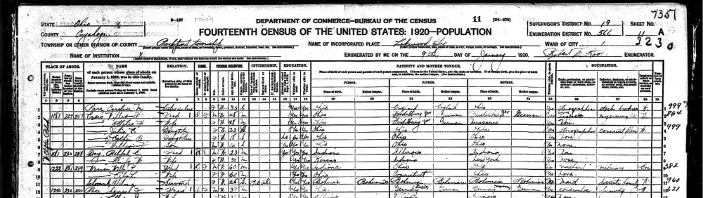
The census data for this analysis are from the Integrated Public-Use Microdata Series (IPUMS). My data set includes the 1880 to 1990 censuses. The 1890 census results are excluded from this data set because the records burned in a fire. My data set excludes Alaska and Hawaii before they achieved statehood in 1959. They were technically part of the U.S. prior to that, but as territories rather than states. The IPUMS data include other states before they were granted statehood, but the problem with Alaska and Hawaii is that they are not in IPUMS samples for 1940-1950. Therefore I also exclude them from the 1900-1930 census data in order to be consistent. I will be using the 1% sample from each census year. Exceptions include the 1970 census, for which I will use the 1% State Form 1 Sample, and the 1980 census, for which I will use the 1% Metro Sample. IPUMS has randomly selected these 1% samples. The IPUMS variable RACED is used for the analysis. For all censuses prior to 1960, the race variable was recorded by an enumerator. Beginning in 1960 the census changed to a self-report format. All analyses are weighted by PERWT, the individual sample weight provided by IPUMS.
Method:
I begin by focussing the analysis of the RACED variable on all races that refer to countries in Asia and the pacific. I classify these race variables into seven categories and label them A-G in the visualization below. Group A includes everyone classified as a Pacific Islander; group C includes everyone classified as Japanese; group D includes everyone classified as Hawaiian; group E includes everyone classified as Chinese; group F includes everyone classified as one of the thirteen race classifications that were added to the census in 1990 (Taiwanese, Vietnamese, Cambodian, Hmong, Laotian, Thai, Bangladeshi, Burmese, Indonesian, Malaysian, Okinawan, Pakistani, and Sri Lankan); group G includes everyone classified as Filipino, Hindu/Asian indian, and Korean; group B includes all other individuals who did not fit into one of these categories. These groups correspond to both geography and patterns of immigration to the United States.
The census only permitted one race classification, so my analysis does not account for the possibility of multiple identification. Additionally before 1960 the enumerators were responsible for reporting people’s race classification. Self-identification may have differed from the census’ reported classification for all years prior to 1960. Code for analysis and visualization is available here.
Figure 1:
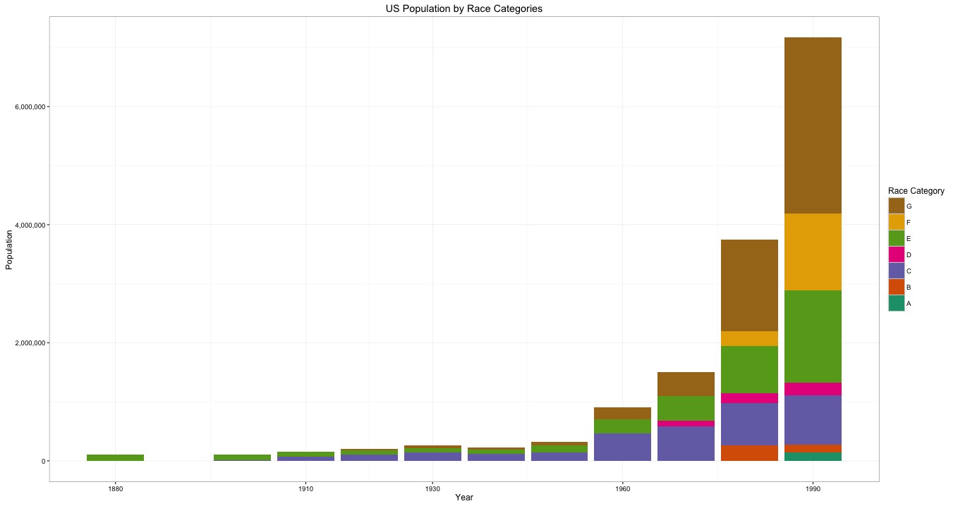
Group A: Pacific Islander
Group B: Other
Group C: Japanese
Group D: Hawaiian
Group E: Chinese
Group F: Added in 1990 (Taiwanese, Vietnamese, Cambodian, Hmong, Laotian, Thai, Bangladeshi, Burmese, Indonesian, Malaysian, Okinawan, Pakistani, and Sri Lankan)
Group G: Filipino, Hindu/Asian Indian, and Korean
Figure 1 graphs the asian population from 1880 to 1990. The total asian population for each year is then subdivided into the population of each race category and indicated by color. The asian population increases over time. There is a dramatic shift in asian population growth between the 1950 and 1960 census. Furthermore as time progresses there are an increasing specification in classification of asian. For example in 1880 the census only classifies asians as Chinese (Group E). Beginning in 1900 the Japanese race category (Group C) appears on the census. Then from 1930 onward there is an evident trend of finer and finer gradations of classification. Group G, which first appears in 1930, includes individuals classified as Filipino, Hindu/Asian Indian and Korean. In 1970 the Hawaiian race category appears (Group D). The 1990 census is the only census year to exhibit population in the Pacific Islander category (Group A).
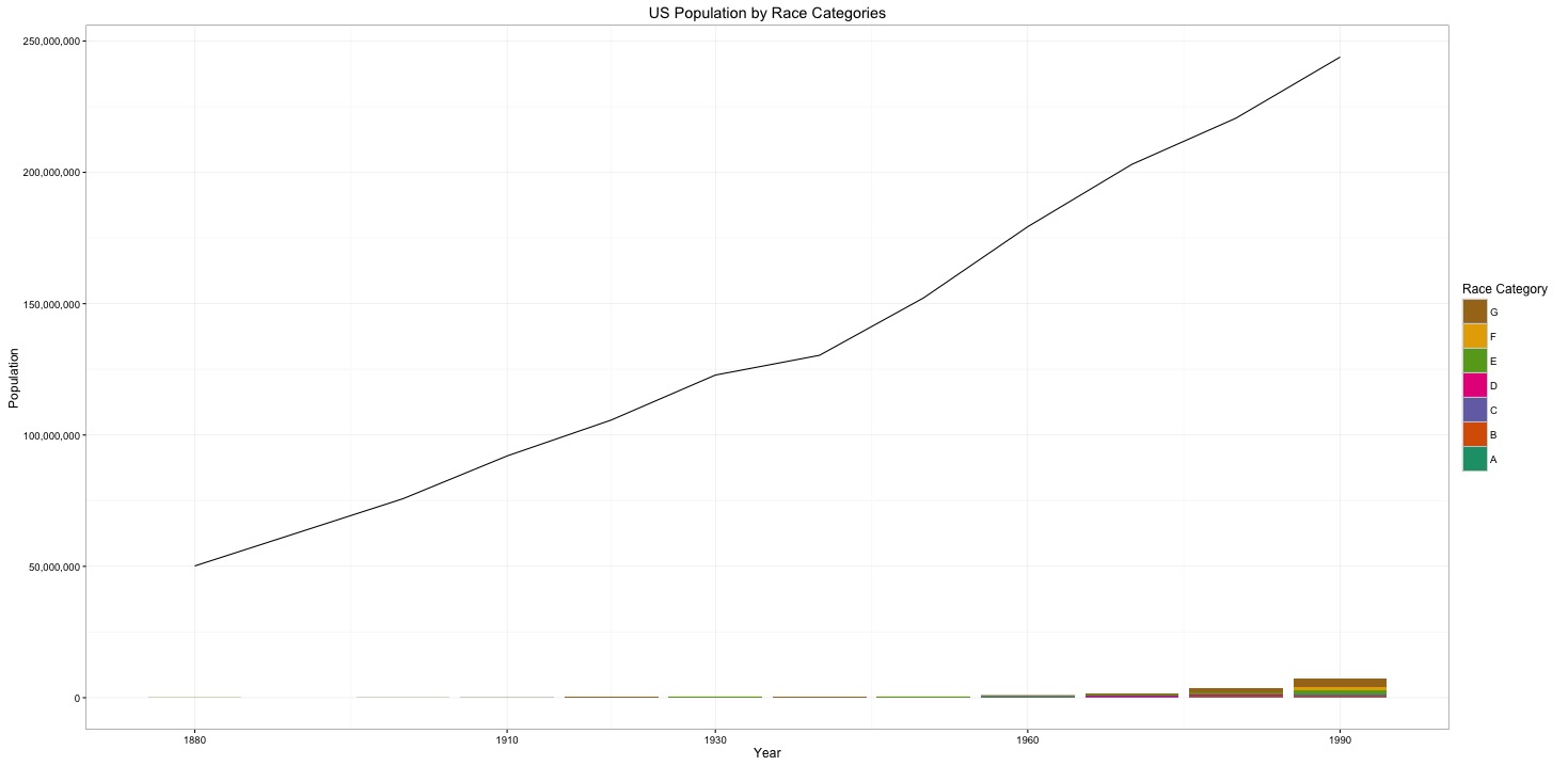
Figure 2: Figure 2. The Asian population with respect to the total American population.
Group A: Pacific Islander
Group B: Other
Group C: Japanese
Group D: Hawaiian
Group E: Chinese
Group F: Added in 1990 (Taiwanese, Vietnamese, Cambodian, Hmong, Laotian, Thai, Bangladeshi, Burmese, Indonesian, Malaysian, Okinawan, Pakistani, and Sri Lankan)
Group G: Filipino, Hindu/Asian Indian, and Korean
Figure 2 graphs the total population of the United States and the total asian population on the same graph. The asian population has always been minuscule in comparison to the total american population. The asian population grew from 113,161 people in 1880 to 7,166,896 people in 1990. The total american population grew from 50,152,560 people in 1880 to 243,878,788 in 1990.
Figure 3:

Group A: Pacific Islander
Group B: Other
Group C: Japanese
Group D: Hawaiian
Group E: Chinese
Group F: Added in 1990 (Taiwanese, Vietnamese, Cambodian, Hmong, Laotian, Thai, Bangladeshi, Burmese, Indonesian, Malaysian, Okinawan, Pakistani, and Sri Lankan)
Group G: Filipino, Hindu/Asian Indian, and Korean
Figure 3 graphs the asian population as a percentage of the total population of the United States. From 1880 to 1970 the asian population remains under 1% of the total american population. At the end of the period of analysis (1990), the Asian population reaches nearly 3% of the total american population.
Conclusion:
The increasing precision of asian race classification demonstrated in the census from 1880 to 1990 is likely a response to increasing asian immigration. Kenneth Prewitt, in What is Your Race? The Census and Our Flawed Efforts to Classify Americans, concludes chapter 5 with a claim of the nature in which racial data influence policy. Prewitt states that racial statistics collected through the census do not cause repressive policies. He does, however, make the claim that without racial statistics, quota-based immigration restriction would not have been possible (2013, 77). The increasing precision of data collection on the asian race, therefore, is indicative of increasing government interest in who is in the United States.
Precision of asian identification was particularly important for the purposes of race science. Race science was developed by nativists with the goal of proving the scientific superiority of certain races over others. Census data were used as evidence for race science and therefore the racial classifications in the census are indicative of the interests of race scientists. Specifically, the precise identification of asians in the census, is a reflection of nativist effort to exclude asian immigrants. As immigration from Asia and the Pacific increased, the census bureau added finer gradations of asian race classification. Jennifer Hochschild and Brenna Powell would explain this pattern as a governmental effort by the white power holders to exclude the “perennial foreigners” (2008, 71). The pattern of precise collection of asian race data reflects how asian people were defined by the census bureau and viewed by nativists as racially distinct from one another.
Grounds for Chinese exclusion from civic american society were made on the theory that the Chinese were radically different than the Japanese. The Japanese were referred to as the “Frenchmen of the east” because of their “Turkish blood” (Hochschild and Powell 2008, 73). Evidence-less race theory such as this perpetuated the distinction between asian people on the census. The collected race data could be used for racial projects or for the sake of blocking naturalization.
Bibliography:
Prewitt, Kenneth. “How Many White Races Are There?” What Is Your Race?: The Census and Our Flawed Efforts to Classify Americans. Princeton, NJ: Princeton UP, 2013. N. pag. Print.
Hochschild, Jennifer L., and Brenna Marea Powell. “Racial Reorganization and the United States Census 1850–1930: Mulattoes, Half-Breeds, Mixed Parentage, Hindoos, and the Mexican Race.” Studies in American Political Development 22.1 (2008): 59-96. Web.