Native Americans and the Census

Native Americans were originally only included in the census if they lived under US jurisdiction. Because Native Americans were largely considered independent, they were excluded from the census and were not apportioned Congressional representatives. “Representatives and direct Taxes shall be apportioned among the several States which may be included within this Union, according to their respective Numbers, which shall be determined by adding to the whole Number of free Persons, including those bound to Service for a Term of Years, and excluding Indians not taxed” (Article 1, Section 2 of the U.S. Constitution).

The 1850 census is the first census that allows us to look at individual Native Americans and how they were counted in the census. With Native American census data and enumerator instructions, we can better understand how the federal government understood Native Americans as a race and the relationship between the federal government and Native Americans.

Data & Method:

I collected census data from the Integrated Public Use Microdata Series- United States of American (IPUMS-USA). My census data includes 1% samples from 1850 to 1950.

I exclude Hawaii and Alaska from my analyses, as they were not US territories until 1898 and 1912. Additionally, the 1940 and 1950 censuses do not include Alaska or Hawaii. I also exclude any other US territories and overseas military bases. Hawaii, Alaska and other territories would skew my data and offer little value to my analyses.

Unfortunately, the destruction of the 1890 census prevents us from fully analyzing the affect government policies had on the enumeration of Native Americans between 1881 and 1900. The 1900 census was the first census all Native Americans were enumerated, regardless of tribal affiliations or where they lived.

I first assigned each RACED category a label for the correct race. I weighted each individual’s weight with IPUMS PERWT variable and then summed each racial category by year with the PERWT variable. Next I split the racial categories into “Native American” and “Rest of Population (Not Native).” I then plotted the Native American population. Finally, I used Microsoft Excel to tidy up and display my table.

Click HERE for my R code

Results:

Figure 1: Native American population graph. 1850 - 1950.

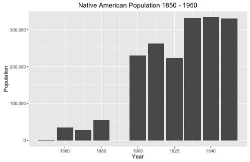
Figure 1: Native American population graph. 1850 – 1950.

Figure 1 depicts the population of Native Americans from 1850 to 1950. During this time, Native American counted in the census increased from 907 to 329,441, an amazing 36,222% increase. Meanwhile, the overall American population only increased 660%. Figure 2 displays the exact population numbers for each year and compares Native Americans to non-Native Americans. Figure 2 proves that the Native American population boom can only be explained by changes in how Native Americans were enumerated in the census.

Figure 2: Population of Native Americans and Non-Native Americans. 1850 - 1950.  Table.

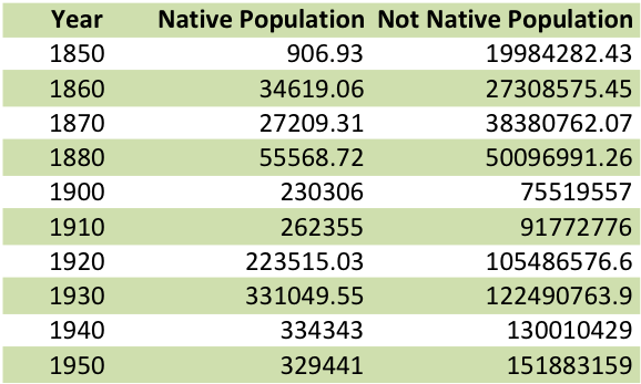
Figure 2: Population of Native Americans and Non-Native Americans. 1850 – 1950. Table.

Figure 2 displays the exact population numbers for each year and compares Native Americans to non-Native Americans. Figure 2 proves that the Native American population boom can only be explained by changes in how Native Americans were enumerated in the census.

The 1850 Census Enumerator Instructions maintain the same instructions used since the 1790 Census, “Indians not taxed are not to be enumerated in this or any other schedule,” however, in 1860, the instructions for Native Americans start to become more complex. Now, “Indians who have renounced tribal rule, and who under State or Territorial laws exercise the rights of citizens, are to be enumerated,” and were assigned a distinct racial category of “Ind.” Native Americans’ race was determined by their lack of tribal affiliation and U.S. citizenship. Now that Native Americans had been assigned a distinct racial category, their census numbers increase by 3,817%.

In 1870 enumeration instructions again changed for Native Americans. The census found it “highly desirable, for statistical purposes” to count Native Americans, not taxed, living on reservations. However, the 1880 census gave less instructions on how to count Native Americans. Native Americans not taxed were now defined to be those “living on reservations under the care of Government agents” ( Enumerators were also instructed to count Native Americans as “ordinary” (or white) if they lived in society. This new definition and categorization may be because of the Indian Appropriation Act of 1871 which declared, “No Indian nation or tribe within the territory of the United States shall be acknowledged or recognized as an independent nation” and created reservations (25 USC 71, 1871).

By 1890 and 1900, enumerator instructions no longer included any mention of “Indians not-taxed” or instructions on how to classify Native Americans. Enumerators were instructed to write “Ind.” for Native Americans. As Prewitt noted, the Indian Wars ended by 1886 and “the red race [was] assimilated” (Prewitt 2013, 36). By 1900, all Native Americans were counted in the census. The Indian question was solved by 1900 (Prewitt 2013, 36). However, if the Indian question was truly solved then there would be no reason to categorize and assimilate Native Americans as white after 1900.

The loss of the 1890 census data makes it difficult to analyze the affect the Dawes Act had on the counting of Native Americans in the census. The Dawes Act of 1887 allowed the president to forcibly assimilate Native Americans by terminating their reservation, granting those Native Americans citizenship and individual land parcels to live and farm on.

In 1930, Native Americans were classified as Indian according to blood quanta. However, a Native American was capable of being classified as white if “he is regarded as a white person by those in the community where he lives.” The census enumerator instructions supports Prewitt’s claim that Native Americans are able to assimilate and become white. Native Americans classified as white are difficult to find in the census as they are no longer classified as “Ind.” in the census. Other variables such as MBPL and FBPL may help us identify Native Americans reclassified as white. The 1940 and 1950 census enumerator instructions continue to use blood quanta and acceptance in the community to determine if someone is racially Native American.

Conclusion

Native Americans were considered to be an assimilable race by the U.S. government in order to force Native Americans onto reservations and strip them of their sovereign nation rights and treaties. Census enumerator instructions show how over the decades, Native Americans were counted for non-taxable purposes, and then increasingly counted and counted as whites. Native Americans’ racial status changed as the federal government’s desire for Native American land changed. Once the Native Americans had been stripped of their land, they were classified according to conventional blood quanta measurements and community acceptance criteria which allowed them to be categorized as white.

Works Cited

Article 1, Section 2 of the U.S. Constitution. http://www.ourdocuments.gov/doc.php?doc=9&page=transcript

“Dawes Act.” Dawes Severalty Act Of 1887 (2009): 1. Our Documents. Web. 25 Jan. 2016. http://www.ourdocuments.gov/doc.php?doc=50&page=transcript

“Indian Apportionment Act of 1871,” 25 US Code 71, 1871. https://www.law.cornell.edu/uscode/text/25/71

IPUMS and IPUMS Census Enumerator Instructions (https://usa.ipums.org/usa/voliii/tEnumInstr.shtml)

Prewitt, Kenneth. “The Compromise that Made the Republic and the Nation’s First Statistical Race.” What Is Your Race?: The Census and Our Flawed Efforts to Classify Americans. Princeton, NJ: Princeton UP, 2013. N. pag. Print.

Asian Classification (1880-1990)

Collection of census data is a method of discovering who the country is made of. The data collected from the census shapes government policy. More specifically the race classification of the census provides data that are used for racial projects (either to repress or to benefit certain types of people). In this post I analyze the manner in which the asian population in the United States is classified from 1880 to 1990. In contrast to the simple manner in which white and black people are classified in the census, asian people are classified with increasing precision over time. However the label “asian” is representative of a geographic region. In other words the manner in which the Asian race is defined is directly associated with nationality. This contrasts European identification as white or African identification as black. It is important to study the collection of race data because the census data were used as evidence for race science. Race science claimed the superiority of some race groups over others and, therefore, justified exclusionary policies.

Data:

The census data for this analysis are from the Integrated Public-Use Microdata Series (IPUMS). My data set includes the 1880 to 1990 censuses. The 1890 census results are excluded from this data set because the records burned in a fire. My data set excludes Alaska and Hawaii before they achieved statehood in 1959. They were technically part of the U.S. prior to that, but as territories rather than states. The IPUMS data include other states before they were granted statehood, but the problem with Alaska and Hawaii is that they are not in IPUMS samples for 1940-1950. Therefore I also exclude them from the 1900-1930 census data in order to be consistent. I will be using the 1% sample from each census year. Exceptions include the 1970 census, for which I will use the 1% State Form 1 Sample, and the 1980 census, for which I will use the 1% Metro Sample. IPUMS has randomly selected these 1% samples. The IPUMS variable RACED is used for the analysis. For all censuses prior to 1960, the race variable was recorded by an enumerator. Beginning in 1960 the census changed to a self-report format. All analyses are weighted by PERWT, the individual sample weight provided by IPUMS.

Method:

I begin by focussing the analysis of the RACED variable on all races that refer to countries in Asia and the pacific. I classify these race variables into seven categories and label them A-G in the visualization below. Group A includes everyone classified as a Pacific Islander; group C includes everyone classified as Japanese; group D includes everyone classified as Hawaiian; group E includes everyone classified as Chinese; group F includes everyone classified as one of the thirteen race classifications that were added to the census in 1990 (Taiwanese, Vietnamese, Cambodian, Hmong, Laotian, Thai, Bangladeshi, Burmese, Indonesian, Malaysian, Okinawan, Pakistani, and Sri Lankan); group G includes everyone classified as Filipino, Hindu/Asian indian, and Korean; group B includes all other individuals who did not fit into one of these categories. These groups correspond to both geography and patterns of immigration to the United States.

The census only permitted one race classification, so my analysis does not account for the possibility of multiple identification. Additionally before 1960 the enumerators were responsible for reporting people’s race classification. Self-identification may have differed from the census’ reported classification for all years prior to 1960. Code for analysis and visualization is available here.

Figure 1:

Group A: Pacific Islander Group B: Other Group C: Japanese Group D: Hawaiian Group E: Chinese Group F: Added in 1990 (Taiwanese, Vietnamese, Cambodian, Hmong, Laotian, Thai, Bangladeshi, Burmese, Indonesian, Malaysian, Okinawan, Pakistani, and Sri Lankan) Group G: Filipino, Hindu/Asian Indian, and Korean

Group A: Pacific Islander
Group B: Other
Group C: Japanese
Group D: Hawaiian
Group E: Chinese
Group F: Added in 1990 (Taiwanese, Vietnamese, Cambodian, Hmong, Laotian, Thai, Bangladeshi, Burmese, Indonesian, Malaysian, Okinawan, Pakistani, and Sri Lankan)
Group G: Filipino, Hindu/Asian Indian, and Korean


Figure 1 graphs the asian population from 1880 to 1990. The total asian population for each year is then subdivided into the population of each race category and indicated by color. The asian population increases over time. There is a dramatic shift in asian population growth between the 1950 and 1960 census. Furthermore as time progresses there are an increasing specification in classification of asian. For example in 1880 the census only classifies asians as Chinese (Group E). Beginning in 1900 the Japanese race category (Group C) appears on the census. Then from 1930 onward there is an evident trend of finer and finer gradations of classification. Group G, which first appears in 1930, includes individuals classified as Filipino, Hindu/Asian Indian and Korean. In 1970 the Hawaiian race category appears (Group D). The 1990 census is the only census year to exhibit population in the Pacific Islander category (Group A).

Figure 2: Figure 2. The Asian population with respect to the total American population.

Group A: Pacific Islander Group B: Other Group C: Japanese Group D: Hawaiian Group E: Chinese Group F: Added in 1990 (Taiwanese, Vietnamese, Cambodian, Hmong, Laotian, Thai, Bangladeshi, Burmese, Indonesian, Malaysian, Okinawan, Pakistani, and Sri Lankan) Group G: Filipino, Hindu/Asian Indian, and Korean

Group A: Pacific Islander
Group B: Other
Group C: Japanese
Group D: Hawaiian
Group E: Chinese
Group F: Added in 1990 (Taiwanese, Vietnamese, Cambodian, Hmong, Laotian, Thai, Bangladeshi, Burmese, Indonesian, Malaysian, Okinawan, Pakistani, and Sri Lankan)
Group G: Filipino, Hindu/Asian Indian, and Korean

Figure 2 graphs the total population of the United States and the total asian population on the same graph. The asian population has always been minuscule in comparison to the total american population. The asian population grew from 113,161 people in 1880 to 7,166,896 people in 1990. The total american population grew from 50,152,560 people in 1880 to 243,878,788 in 1990.

Figure 3:

Group A: Pacific Islander Group B: Other Group C: Japanese Group D: Hawaiian Group E: Chinese Group F: Added in 1990 (Taiwanese, Vietnamese, Cambodian, Hmong, Laotian, Thai, Bangladeshi, Burmese, Indonesian, Malaysian, Okinawan, Pakistani, and Sri Lankan) Group G: Filipino, Hindu/Asian Indian, and Korean

Group A: Pacific Islander
Group B: Other
Group C: Japanese
Group D: Hawaiian
Group E: Chinese
Group F: Added in 1990 (Taiwanese, Vietnamese, Cambodian, Hmong, Laotian, Thai, Bangladeshi, Burmese, Indonesian, Malaysian, Okinawan, Pakistani, and Sri Lankan)
Group G: Filipino, Hindu/Asian Indian, and Korean

Figure 3 graphs the asian population as a percentage of the total population of the United States. From 1880 to 1970 the asian population remains under 1% of the total american population. At the end of the period of analysis (1990), the Asian population reaches nearly 3% of the total american population.

Conclusion:

The increasing precision of asian race classification demonstrated in the census from 1880 to 1990 is likely a response to increasing asian immigration. Kenneth Prewitt, in What is Your Race? The Census and Our Flawed Efforts to Classify Americans, concludes chapter 5 with a claim of the nature in which racial data influence policy. Prewitt states that racial statistics collected through the census do not cause repressive policies. He does, however, make the claim that without racial statistics, quota-based immigration restriction would not have been possible (2013, 77). The increasing precision of data collection on the asian race, therefore, is indicative of increasing government interest in who is in the United States.

Precision of asian identification was particularly important for the purposes of race science. Race science was developed by nativists with the goal of proving the scientific superiority of certain races over others. Census data were used as evidence for race science and therefore the racial classifications in the census are indicative of the interests of race scientists. Specifically, the precise identification of asians in the census, is a reflection of nativist effort to exclude asian immigrants. As immigration from Asia and the Pacific increased, the census bureau added finer gradations of asian race classification. Jennifer Hochschild and Brenna Powell would explain this pattern as a governmental effort by the white power holders to exclude the “perennial foreigners” (2008, 71). The pattern of precise collection of asian race data reflects how asian people were defined by the census bureau and viewed by nativists as racially distinct from one another.

Grounds for Chinese exclusion from civic american society were made on the theory that the Chinese were radically different than the Japanese. The Japanese were referred to as the “Frenchmen of the east” because of their “Turkish blood” (Hochschild and Powell 2008, 73). Evidence-less race theory such as this perpetuated the distinction between asian people on the census. The collected race data could be used for racial projects or for the sake of blocking naturalization.

Bibliography:

Prewitt, Kenneth. “How Many White Races Are There?” What Is Your Race?: The Census and Our Flawed Efforts to Classify Americans. Princeton, NJ: Princeton UP, 2013. N. pag. Print.

Hochschild, Jennifer L., and Brenna Marea Powell. “Racial Reorganization and the United States Census 1850–1930: Mulattoes, Half-Breeds, Mixed Parentage, Hindoos, and the Mexican Race.” Studies in American Political Development 22.1 (2008): 59-96. Web.

Asian Race Categorization in the United States 1900-1970

Image

Since Asian immigrants first arrived on the west coat of the United States just before the Civil War, their journey of racial classification has been a complicated one (Hochschild 2008, 71). Within the past century, the U.S. Census Bureau has changed the number and labels of Asian races on the census almost annually. For example, in the 1850 census, there was no box for any Asian race. In 1870, the only Asian race was Chinese. By 1890, the census distinguished between Chinese and Japanese people, and by 1970, a total of five Asian races were listed. I believe that this evolution can be attributed to two factors. First, the American perception regarding different Asian races changed over time. These views are largely shaped by the historical context surrounding each census, both in the United States, and in the native countries of these Asian groups. How the U.S. government defined race became a question of “who would be allowed to join the insiders of American society rather than being excluded or remaining on the margins as perennial foreigners” (Hochschild 2008, 71). Second, the changes in which Asian races listed on the census reflect the ambiguity in defining what a race actually is, and the difficulty in classifying individuals into such a race. The fact that immigrants from East Asia also had “white” skin further complicated their classification. Kenneth Prewitt argues in his book, What Is Your Race?: The Census and Our Flawed Efforts to Classify Americans, that “the Asian category references neither color nor culture. It is understood in the directive as a catchall racial home” (Prewitt 2013, 101). He then points out that this classification system has not been significantly revisited, arguing “The 1870 decision to racialize these nationality groups and to assemble them in one umbrella category was not questioned a century later” (Prewitt 2013, 102). I use United States census data from 1900 to 1970 to explore the trends in the breakdown of this “umbrella category” because this period of time encompasses a variety of momentous historical events for Asian-Americans, including of the Chinese Exclusion Act, Japanese-American internment, and the Immigration and Nationality Act of 1965.

Data

In order to analyze the classification of Asian races in the U.S. census, I used Integrated Public-Use Microdata Series (IPUMS) 1% samples from 1910-1970. For the 1970 data, I used the 1% State Form 1 Sample.

I use PERWT to calculate the number of people in each racial category in each year. The IPUMS variable RACE is a broad race category and can hold the following values: white, black, IAIN (American Indian or Alaskan Native), Chinese, Japanese, OAPI (Native Hawaiian and Other Pacific Islander), and other. The “other” category is reserved for individuals who are not clearly one of the other races. Depending on the year, the listed races on the census vary. Within each broad race category, IPUMS provides the variable RACED, which reflects the categories used by enumerators and individuals filling in self-report forms. I use RACE to determine who I will include in my analysis, and then I use RACED to see how those people were actually classified in the census. RACED is the main variable I use in my analysis.


Methods

I use the IPUMS data to explore which RACED values are available in which year and why. I also observe the number of individuals in each of those race categories to see how that changes with time.

It is important to note that just because a new race category is introduced in a particular year, that does not mean that that race of people was also new to the United States. Rather, the United States government felt the need to define that race separately in that year. This distinction is important. As I look at trends, I will be considering where the census would have categorized individuals of the newer races in the in the previous census year.

The R code I used to generate the results below can be found here.

Results

Figure 1 shows how the races listed on the census change over time between 1900 and 1970. The Chinese immigrants who came to the United States in the beginning of the 20th century settled primarily in California for labor purposes. They immigrated to either mine for gold in California, or to be contracted workers building the transcontinental railroad. Americans sometimes, but not always, recruited the latter group of workers while they still lived in China, and then they immigrated once they already had a job. Enumerators counted immigrants from China as white in the 1860 census, except in California, where they counted them as “Asiatic” (Hochschild 2008, 71). As more Eastern Asian immigrants came to the United States, the Census Bureau classified them in order to exclude the newcomers from white privilege. In 1870, “Chinese” appeared on the census alone with white, black, mulatto, and Indian. Enumerators included Japanese people in the Chinese count, but excluded Hawaiians, who were likely counted as white. By 1920, “enumerators were told to distinguish among Chinese, Japanese, Filipino, Hindu, Korean, and Other” (Hochschild 2008, 72), which I show in Figure 1.

Hochschild and Powell argue that census officials never clarified why Asian races were granularly divided by nationality, rather than referring to them as “Asiatics” or “Mongolians.” According to them, “the 1906 Supplementary Analysis on race noted ‘little scientific ground for attempting to discriminate between the Chinese and the Japanese as of different races. They regard themselves and are regarded by ethnologists as closely related branches of the great Mongolian, or yellow, race'” (Hochschild 2008, 73). The court case In re Ah Yup was brought by a man from China with white skin. He argued that Chinese people should be allowed to naturalize because they had white skin. In this case , the Supreme Court relied on race science to differentiate between between “Asiatic” or “Mongolian” and “Caucasian” in order to prevent the extension of white privilege to Asian races. Ah Yup argued that his skin color was white, but the Supreme Court ruled that the ability to naturalize was only granted to Caucasian individuals.

The 1920-1940 censuses list a separate “Hindoo” category (Asian Indian in Figure 1) in order to separate the “white” race from the caucasian, Western European race that had the privilege in the Unites States at the time. In the case of United States v. Thind, the Supreme Court formally banned South Asians from naturalizing as American citizens. The Supreme Court used social science rather than race science to justify this ruling (Hochschild 2008, 73). Race scientists could not explain that South Asians were biologically separate, because the white race originated in South Asia, according to race scientists. In order to justify the separation, proponents of the decision used social science. This was a small racial category, and was only on the census in 1920, 1930, and 1940; then it was removed.

Although some officials viewed individuals from China and Japan as the same, the public generally viewed them as distinct races with different prospects for assimilation. As shown in the figure, the share of Japanese increased between 1900 and 1910, while the Chinese share decreased. Americans regarded Chinese very poorly, while they compared Japanese to Frenchmen, and saw them as much closer in status to the white race. Many policies reflected this poor treatment of Chinese people. The most notable was the Chinese Exclusion Act signed by Chester A. Arthur in 1882, which prohibited all immigration of Chinese laborers, who were inexpensive at the time. The United States government made the “temporary” act permanent in 1902, until they finally repealed in 1943. In Figure 1, the Chinese population share increases between the 1940 and 1950 census for that reason.

Figure 1:

breakdowns

It is not only important to observe which races the census listed, but also to explore the number of individuals enumerators counted in each. Figures 2 and 3 show the number of people categorized in Asian races and the percent of the U.S. population categorized in Asian races over time, respectively. They show similar trends. Between 1900 and 1930, there is a steady increase in both the absolute Asian population, as well as the Asian share of the U.S. population. There was then a dip in 1940, likely due to the 1924 Immigration Act, which greatly restricted the number of new immigrants to the U.S.. In the 1970 census, there is a sharp increase in the number and share of Asian races by nearly double. This increase can be attributed to the 1965 Immigration and Nationality Act, which abolished the U.S. quota system, therefore allowing more immigrants from Asian countries. It is also important to note that although the share of the Asian population increased over this time period, their total share of the U.S. population was quite small, only reaching about 0.8% in 1970.

Figure 2:

numbertrends

Figure 3:

trends

Conclusion

The Asian races in the United States experienced many changes from the 1850’s to now. I examined the period between 1910 and 1970 because it highlights some key moments of classification, and therefore inevitable discrimination, of different Asian populations. These classifications reflect the government of the United States just as much, if not more, than it reflects the Asian populations, because it shows us who the government wanted to define, and therefore exclude, from certain rights. The Asian race is also interesting to observe because it shows the shift from race science to social science as a means of classifying and “othering” different cultural groups to continue the American tradition of white privilege.

Works Cited

  • Prewitt, Kenneth. What Is Your Race?: The Census and Our Flawed Efforts to Classify Americans. Princeton, NJ: Princeton UP, 2013. Print.
  • Hochschild, Jennifer L., and Brenna Marea Powell. “Racial Reorganization and the United States Census 1850–1930: Mulattoes, Half-Breeds, Mixed Parentage, Hindoos, and the Mexican Race.” Stud. in Am. Pol. Dev. Studies in American Political Development 22.01 (2008): 59-96. Print.

Age Heaping in the U.S. Census

As early as 1900, statisticians associated with the U.S. Census Bureau were aware of the tendency of respondents to misreport their age or the age of those for whom they were responding in the census (Young 1900). One of the most common types of age misreporting is “age heaping,” which demographer Melvin Zelnik described in 1961 as “the recognized phenomenon of people reporting themselves at an age other than, but close to, their true age, as for example, the preference for ages ending in 0 and 5” (Zelnik 1961, 540). In his analysis of the 1880-1950 censuses, Zelnik calculated the percent by which native-born white men and women over- or under-stated each age from 5 to 85, demonstrating that age heaping is a much more complicated phenomenon than a simple “preference for ages ending in 0 and 5.” Indeed, in the 1950 census, Zelnik found that men and women close to the age of 65 were more likely to claim that age; the same was true among women close to the age of 85, while men close to that age were less likely to claim it. Preference for ages ending in 0, meanwhile seemed to increase with age for both men and women, though men close to ages 20 and 30 seemed to have actually avoided stating those ages (Zelnik 1961, 564). In this post, I take a new look at age heaping in the U.S. Census, examining samples from the Integrated Public-Use Microdata Series (IPUMS) for 1850 to 2000. Like Zelnik, I do not identify a simple “preference for ages ending in 0 and 5.” Moreover, the age preferences I do find seem to diminish over time.

Data
Data for this analysis are drawn from the Integrated Public-Use Microdata Series (IPUMS). I use 1% samples for the censuses of 1850-1880 and 1900-2000 (samples for 1890 are not available; for 1970 I use the 1% State Form 1 sample, and for 1980 I use the 1% Metro samples). For 1850-1860, these samples include only free individuals. Prior to 1900, they exclude “Indians not taxed.” In contrast to Zelnik, who examined only native-born men and women between ages 5 and 85, I include all individuals in these samples under age 80. Age was top-coded at 90 in 1980, and at 100 in 1960 and 1970. Limiting my analysis to individuals under age 80 allows me to avoid distortions in the data caused by top-coding and to avoid to some degree distortions caused by higher mortality at older ages (for example, while we could assume that mortality would cause little difference between the number of individuals at ages 21 and 22, it would cause a much larger difference between the number of individuals at ages 81 and 82). The IPUMS variables AGE and SEX indicate self-reported age and sex; PERWT indicates the sample weight of each individual. All analyses described below are weighted by PERWT

Method
I begin with the assumption that the last digit of age should be relatively evenly distributed over the population (that is, there should be relatively similar numbers of people with age ending in 0, 1, 2, etc.). Clearly, this assumption is rather crude. As already mentioned, within any decade of age (e.g. 20s, 30s, etc.), mortality will have taken a higher toll at the older ages than at the younger ages. Inter-annual fluctuations in fertility will also cause some cohorts to be larger and others smaller. Summing across all decades of age by last digit (that is, adding individuals age 1 to individuals age 11 to individuals age 21, etc.) smooths out much of the variability between ages caused by variations in fertility, though the effects of mortality will likely reduce the proportion of the population in the higher “last digits” (that is, we expect more people to have a last digit of 3 than a last digit of 8 simply because more people live to age 23 than 28, 43 than 48, 73 than 78, etc.). As stated above, limiting the analysis to individuals under 80 reduces this source of deviation from even distribution. It must also be remembered that IPUMS data are samples, and are thus subject to sampling error (https://usa.ipums.org/usa/chapter3/chapter3.shtml).

In this analysis, I calculate the last digit of each person’s age by dividing by 10 and taking the remainder, using the remainder function in R (LAST <- AGE%%10). The number of people in each last-digit category are summed by year and sex and divided by the total number of people of each sex in each year. Finally, I graphed the percentage of individuals by sex in each last-digit category in each year. Code for analysis and visualization is available here.

Results

Figure 1. Last digit of age as a percentage of total population, by sex, for the census of 2000. Image created by author using data from www.ipums.org.

Figure 1. Last digit of age as a percentage of total population, by sex, for the census of 2000. Image created by author using data from www.ipums.org.

Figure 1 graphs the distribution of the population over last digit of age by sex for the 2000 census. In general, the distribution over age categories is fairly even, though we do see more people in the lower numbers than the higher numbers, as we would expect from the uneven effects of mortality. However, mortality should produce a steadily declining proportion of the population in each last-digit category. Instead, we see a lower percentage of the population with last digit 6 than last digit 7, 8, or 9, for both men and women, suggesting that individuals with a last digit of 6 might be rounding their ages down to an age ending in 5. We also see a somewhat higher proportion of individuals at ages ending in 0 than at any other age, indicating a slight preference for these ages. The preference seems to be greater among men than among women, and for women we also see a higher proportion at ages ending in 9 than ages ending in 6, 7, or 8, suggesting that women might be more likely to round their ages down from years ending in 0 to the previous year ending in 9. Among men, we see a lower percentage with ages ending in 1 than with ages ending in 2, suggesting a preference to round down ages ending in 1 to the previous year ending in 0.

Figure 2. Last digit of age as a percentage of total population, by sex, for the census of 1850. Image created by author using data from www.ipums.org.

Figure 2. Last digit of age as a percentage of total population, by sex, for the census of 1850. Image created by author using data from www.ipums.org.

Figure 2 graphs the distribution of the population over last digit of age by sex for the 1850 census. These results are markedly different from those for the 2000 census. Here we see much more unevenness among last-digit categories. There is a marked tendency to round ages to years ending in 0 for both men and women, as well as a less-marked tendency among both sexes to round ages to years ending in 5 and 2, with 2 more prevalent among women and 5 more prevalent among men. Both genders more likely to report ages ending in 8 than 7, suggesting that some people with ages ending in 7 rounded their ages up, while it is also likely that some of them rounded their ages down. Overall, in 1850, the age distribution suggests a preference for ages ending in 0, 2, 5, and 8 and an avoidance of ages ending in 1, 7, and 9.

Figure 3. Last digit of age as a percentage of total population, by sex and census year, for the censuses of 1850-1880 and 1900-2000. Image created by author using data from www.ipums.org.

Figure 3. Last digit of age as a percentage of total population, by sex and census year, for the censuses of 1850-1880 and 1900-2000. Image created by author using data from www.ipums.org.

Figure 3 graphs the distribution of the population over last digit of age by sex for all censuses from 1850-1880 and 1900-2000. The same preferences and avoidances that appear in 1850 continue to appear in subsequent years, but become less marked over time, with the distribution of the population over last-digit categories substantially evening out by the mid-twentieth century. In 1960, for the first time for women, no category contains more than 11% or less than 9% of the population; the same is true of men for the first time in 1970.

Conclusion

Three factors likely account for the diminishment of age heaping over time. The first is growing numeracy or literacy with numbers. Patricia Cline Cohen (1983) has argued that Americans were a particularly numerate people from the early years of the Republic, when numbers became a source of authority in the policy arena. However, prior to the twentieth century, age mattered little, and people were asked their ages on fairly rare occasions. Documentation of age was also much harder to come by, as birth certificates, drivers’ licenses, and passports did not yet exist. However, the twentieth century saw not only the proliferation of such documentation, but also new legal rights and privileges that were tied to age, such as driving and drinking (voting was always age-delimited). A second factor that likely accounts for the diminishment of age heaping in the twentieth century is the reduction in household size. Census data are collected at the level of the dwelling unit and, prior to 1960, were reported by whoever happened to be home when the enumerator came to the door. Modell and Hareven (1973) have demonstrated that, prior to the twentieth century, few people lived alone and many households included lodgers or servants. It was therefore less likely that anyone who answered the door when the enumerator knocked would be able to accurately report the ages of every person in the dwelling unit. The practice of lodging, however, came under attack from the new family experts of the Progressive Era at the beginning of the twentieth century, and by the second half of the century, the proportions of single-individual households had grown dramatically (Modell and Hareven 1973). Finally, the introduction of the mail-back form in 1960 may also have increased the accuracy of age reporting, as enumerators may in earlier censuses have relied on neighbors to supply information for dwelling units where no residents were home.

Works Cited

  • Cohen, Patricia Cline. 1983. A Calculating People: The Spread of Numeracy in Early America. Chicago: University of Chicago Press.
  • Modell, John and Tamara K. Hareven. 1973. “Urbanization and the Malleable Household: An Examination of Boarding and Lodging in American Families.” Journal of Marriage and Family 35(3): 467-479.
  • Young, Allyn A. 1900. “Age,” pp. 130-174 in Supplementary Analysis and Derivative Tables, Twelfth Census of the United States. Washington, D.C.: U.S. Bureau of the Census.
  • Zelnik, Melvin. 1961. “Age Heaping in the United States Census: 1880-1950.” The Milbank Memorial Fund Quarterly 39(3): 540-573.