
Introduction
Female labor force participation has increased dramatically over the past century across the board, but the stories vary significantly based on race and marital status. I will be looking at females because there is intersectionality between gender and race when looking at income and participation differences, and I hope isolate one gender to see how race and marital status effect females only. Labor outcomes vary for white and non-white women, just as they are different for males and females. Mignon Duffy points out one of these differences in stories when she argues in “Doing the Dirty Work: Gender, Race, and Reproductive Labor in Historical Perspective” that “treatments that focused… on the entrance of women into the labor force in the 1970s told important stories- but also obscured the empirical reality that Black women, immigrant women, and poor women had been engaged in paid market work in large numbers for many decades” (Duffy 2007, 314). It is therefore important to look at female labor force participation and income by race, rather than aggregately. There are also significant differences between married and unmarried women, so marital status must also be taken into account. In this post, I am interested in isolating the female story by looking at labor force participation and median income by race and marital status.
Data
In order to analyze the changes in female labor force participation and female income in the U.S. census, I used Integrated Public-Use Microdata Series (IPUMS) 1% samples from 1880-2000. For the 1970 data, I used the 1% State Form 1 sample, and for the 1980 data, I use the 1% metro sample.
I use the IPUMS variable RACE to classify individuals in my sample as either white (RACE equal to 1), or non-white (RACE not equal to 1). These are the two race categories I use in my analysis. For all years besides 1950, I use the IPUMS variable PERWT to calculate the number of women in the labor force and not in the labor force for each race in each year. In 1950, I use the IPUMS variable SLWT, which reports the number of persons in the general population represented by each sample-line person in the data. According to the IPUMS website, “each household in the 1950 sample includes one individual who was asked supplemental questions… when analyzing the entire population of the persons in units with more than one individual, cases must be weighted in inverse proportion to household size.” The appropriate weight in this case is SLWT for the income variable, because that was a sample-line question on the 1950 census.
For the income analysis, I use years 1940-2000 due to the fact that the census did not ask for income until the 1940 census, so the data is not available before that year. In my analyses, I only look at females between the ages of 18 and 64, which I am defining to be “working aged.”
Methods
I use the IPUMS data to explore changes in female labor force participation, as well as median income, over time for by race and marital status.
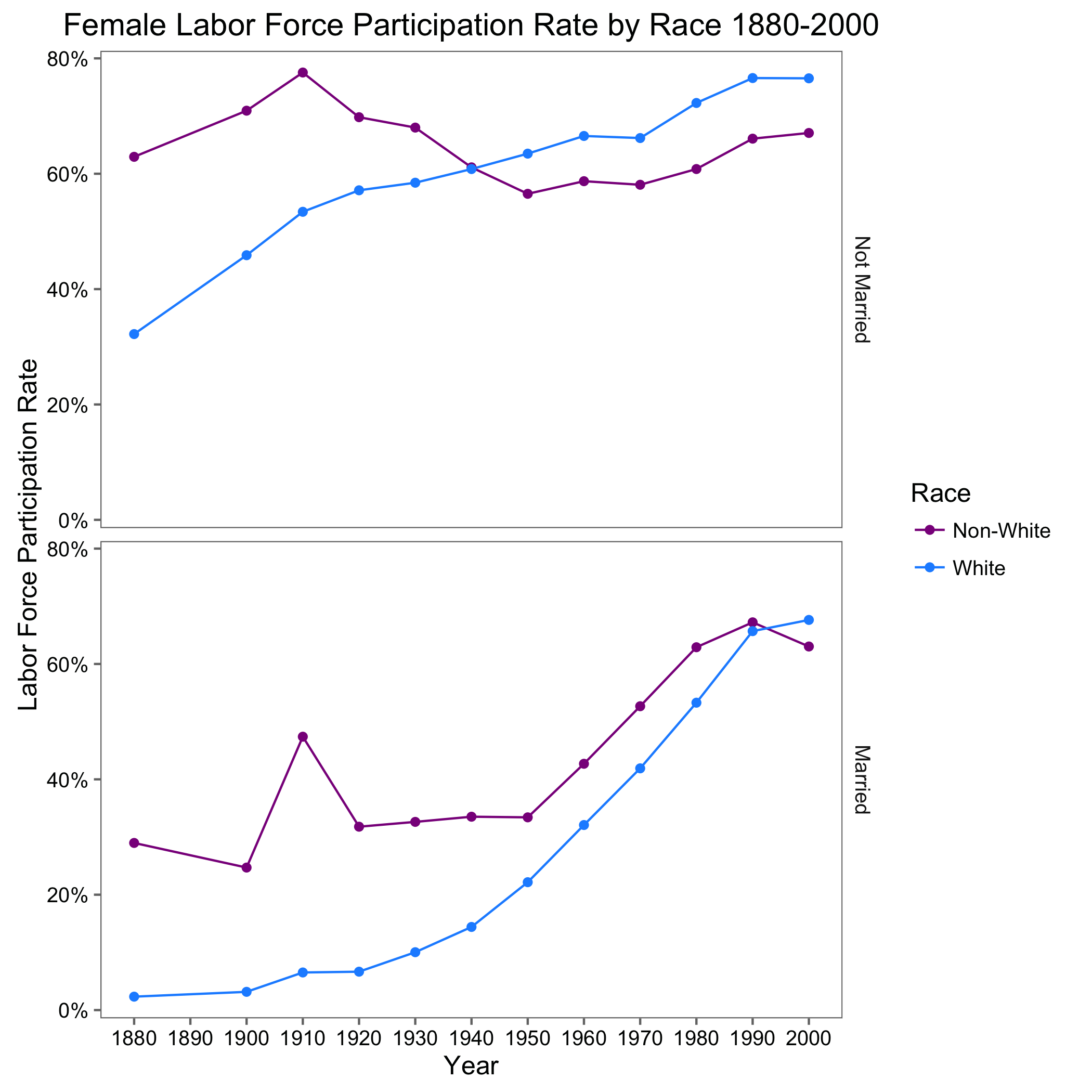
I use the IPUMS variable LABFORCE to calculate female labor force participation over time between 1880 and 2000. LABFORCE is a dummy variable representing whether each woman was in the labor force or not. A woman must be either employed or looking for work to be considered “in the labor force.” This is the main variable I use in my labor force participation analysis. I also use the IPUMS variable MARST to categorize women as either “married” or “not married,” including single, divorced, and widowed. In order to calculate the participation rate, I divide the number of women in the labor force in each year by the sum of the number in the labor force and the number not in the labor force. I do so for both races and both marital statuses, so I have labor force participation for each category in each year 1880-2000. The results are shown in Figure 1.
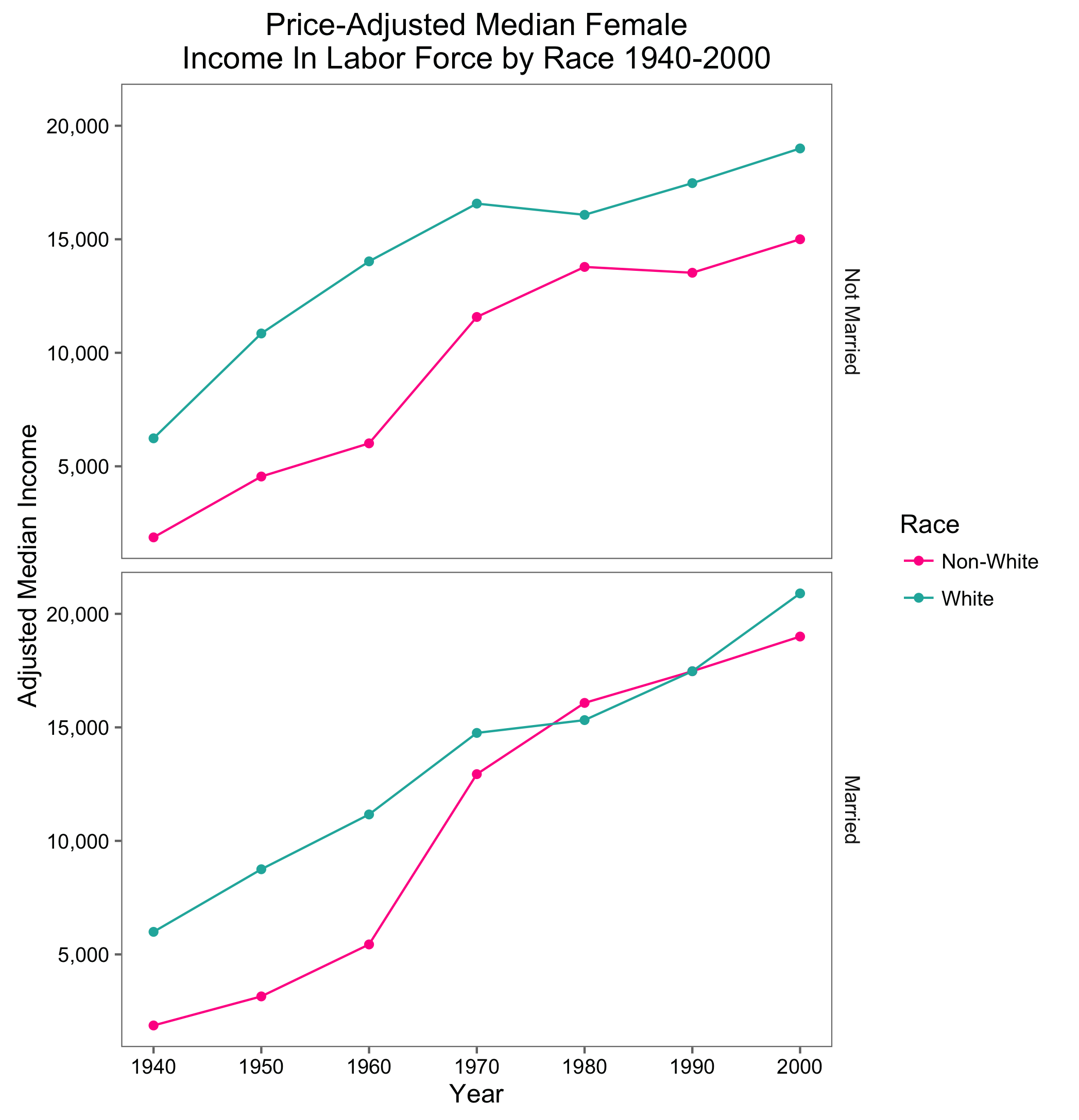
I also observe the median income for both races and marital statuses of women to see how the gap changes between 1940 and 2000. I look at median income in two ways. First, I look at median income for all women. Then, I look at the median income for all women in the labor force, so I can determine whether the key driver of the median income for all women is female labor force participation. I use the IPUMS variable INCWAGE to calculate wages over time. INCWAGE represents the female income for the previous year before taxes, in dollars. This is the main variable I use in my income analysis. I use the variable MARST again in this analysis to categorize women by marital status. To show the changes in income over time for women in these race and marital categories, I take the median income for each race and marriage status in each year, shown in Figure 2. I chose median instead of mean because INCWAGE is top coded, so taking the mean would create bias, likely underestimating the true mean wage. Taking the median does not create the same bias. The median is also a useful indicator of labor force participation. For example, if the median wage is $0, I can conclude that over half of the women were not participating in the labor force that year. To check that the trends I see in income are not just reflecting inflation, I also adjust the median income with price indexes for each year, shown in Figure 3. Because the median wage of all women reflects labor force participation in addition to income, I also calculate the price-adjusted median income for all women in the labor force, shown in Figure 4.
The R code I used to generate the results below can be found here.
Results
Figure 1 shows the female labor force participation rate between 1880 and 2000. For both white and non-white married women, participation in the labor force increased over time. This same increase was seen for white unmarried women, but not non-white unmarried women, who had a stronger presence in the labor force before 1940 than their white counterparts. Although many historians have focused on the sharp increase in women in the work force after 1960, particularly for married women (Duffy 2007), the data show that non-white women were actually in the work force long before this period. Tera Hunter attributed this higher participation rate among non-whites to the high ratio of black women to black men, as well as higher wages for white men then black men. She argues that “the disproportionate sex ratio among blacks made wage work all the more imperative for women, especially for single, divorced, or widowed mothers saddled with the sole responsibility for taking care of their families.” It was not only single women who had to work, because “the low wages paid to black men meant that even married women could rarely escape outside employment and worked in far greater numbers than their white counterparts” (Hunter 1993, 208).
During World War I, the War Department established the “work or fight” rule which entered all unemployed males into the draft. The slogan “labor will win the war” was used to encourage more people to enter the workforce (Departmental Reorganization). Black women were encouraged to work as hired labor in homes during this time, though this was not the beginning of this kind of domestic work for black women. Hunter argues, “black women’s domestic work was essential to the war effort… because it exempted white women from the routine of housework in order that they may do the work which negro women cannot do…domestic work was synonymous with black women in freedom as it was in slavery, and the active efforts by whites to exploit labor clearly circumscribed black lives.” (Hunter 1993).
Over time, the gap between married non-white and white female participation decreased, especially after 1950 when white participation took off due to increasing demand for women in the labor force and the Women’s Rights Movement (Cotter 2001). In 1990, married white women saw higher participation rates than their non-white counterparts for the first time. For unmarried women, whites saw slightly higher participation rates since starting in 1940.
Figure 1:
Figures 2 and 3 show the median income for women by race and marital status between 1940 and 2000. Figure 2 shows median income before adjusting for inflation, while Figure 3 shows median income after the adjustment. Figure 3 is a better graph to show how income was changing relative to prices in each year, which is a more useful metric. The median income for both married race categories is zero in 1940, 1950, and 1960, which means that less than half of the women in each category was participating in the labor force. This finding can be confirmed by observing the participation rate values for those years in Figure 1. Both race and marriage groups experience an increase in wages, both adjusted and not adjusted for inflation. This reflects both a shift in the jobs women performed, as well as an increase in female participation due to the fact that I am observing median income rather than mean income. For most of this time period, unmarried women received higher median wages due to the fact that they participated in wage labor more than married women did in order to support themselves.
Before 1990, the median income for non-white married women was higher than white married women because the non-white participation rate was significantly higher. After 1990, white female participation as well as median white female income were higher for married white women. For unmarried women, the median income was higher across this entire time period.
Figure 2:
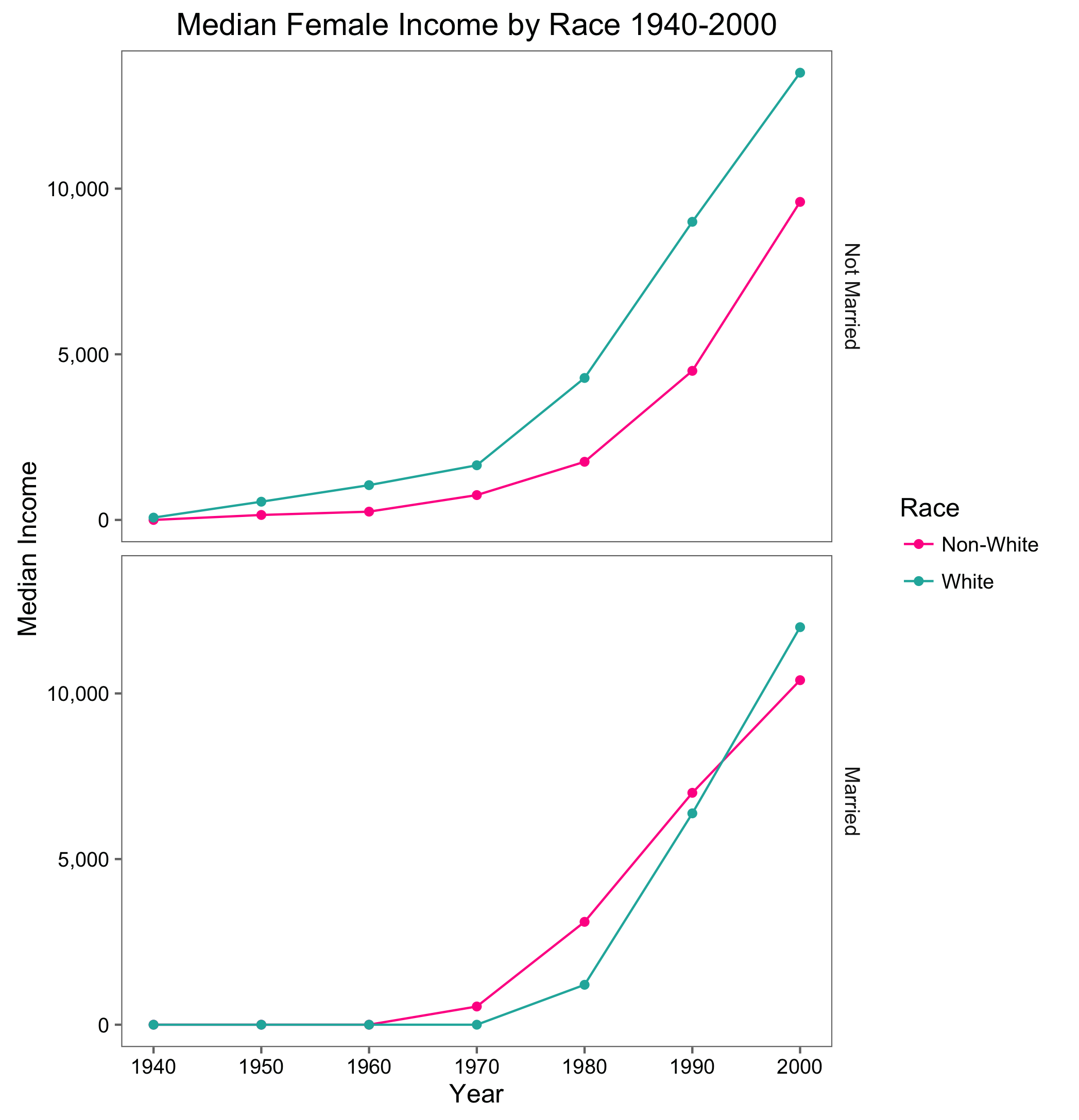
Figure 3:
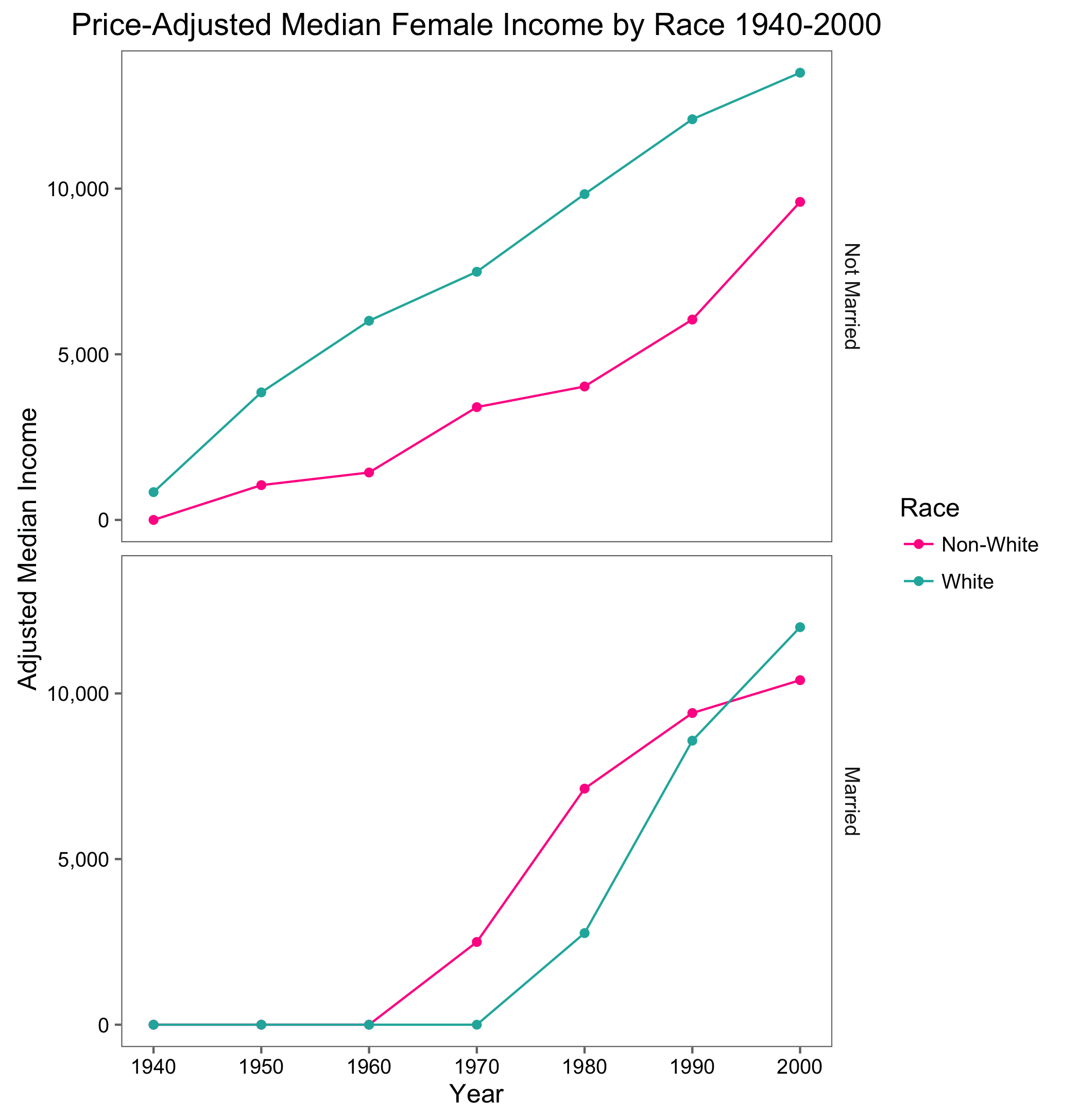
Figure 4 confirms my suspicion that the higher non-white incomes in Figures 2 and 3 are mostly driven by higher labor force participation rates. When only looking at the labor force, white women earn higher median wages for almost all years in both marriage categories, which indicates that white women who chose to participate got higher-paying jobs, or were paid more for the same jobs. Duffy points out that nonwhite women were more overrepresented in low-paying “dirty work” occupations than their white counterparts (Duffy 2007, 329).
Figure 4:
Conclusion
Race and marital status were significant drivers in a woman’s decision to work from 1880 to 2000. Those factors also influenced the median female income. Here, I looked specifically at women, both white and non-white and married and single, to see how their labor outcomes changed between 1880 and 2000. In the first half of this time period, non-whites saw higher labor force participation, especially for married women. They also saw higher median income among married women, but lower median income among unmarried women . The higher income is likely a reflection of the greater participation rates for women without spouses. I confirmed this by looking at income for women in the labor force, and found that white women were paid more almost across the board. Over time, white women saw more participation, especially after the Women’s Rights Movement. They also saw faster income growth than their non-white counterparts. This pattern is consisted for both absolute income, and income adjusted for inflation. These results reflect the racial aspect of the labor systems in the United States today, affording more privileges to white participants.
Works Cited
- Cotter, David A., Joan M. Hermsen, and Reeve Vanneman. “Women’s Work and Women Working: The Demand for Female Labor.” Gender and Society 15.3 (2001): 429-52. JSTOR. Sage Publications, Inc. Web. 13 Dec. 2014.
- “Departmental Reorganization Act.” Wikipedia. Wikimedia Foundation, n.d. Web. 13 Feb. 2016.
- Duffy, M. “Doing the Dirty Work: Gender, Race, and Reproductive Labor in Historical Perspective.” Gender & Society 21.3 (2007): 313-36. Print.
- Hunter, Tera W. “Domination and Resistance: The Politics of Wage Household Labor in New South Atlanta.” Labor History 34.2-3 (1993): 205-20. Print.