U.S. History Through Census Data Introduction

In the following blog posts, I use United States census data to analyze patterns in U.S. history. I created these as a part of Dartmouth College’s course “U.S. History Through Census Data,” taught by Emily Merchant. The course had four main units: Race, Migration, Work, and Family. To explore these topics, the class used Integrated Public Use Microdata Series (IPUMS) data, which are samples of individual-level data from each available census starting in 1850.

For the “Race” unit, I analyzed how Asian race categories listed in the United States census changed between 1900 and 1970, and explored how these categories reflected the caucasian American attitude toward these races. When the class discussed “Migration,” I used IPUMS data to estimate the percent of foreign-born immigrants in the United States who were born in Mexico between 1950 and 2000. I also looked at where these Mexican immigrants tended to settle, and explored what led to these immigration patterns. In the “Work” unit, I analyzed the changes in female labor force participation between 1880 and 2000. I also observed how these trends differ between white and non-white women. Finally, in the “Family” unit, I estimated the impact of divorce on children between 1940 and 2000. I performed individual-level analysis to see how the number and percent of children living with a divorced parent changes over this time period. The links to these four blog posts can be found by clicking on the unit name.

Final Portfolio

I have created this portfolio for my US History class using IPUMS data. IPUMS (Integrated Public Use Microdata Series) converts and publishes records of US census data into a consistent format available online for public use. This resource has been particularly useful for my research because it has pre-selected and randomized 1% samples of US census data. Using the pre-made 1% samples I was able able to manipulate census data in order to study historical trends in the United States.

I completed four projects on the topics of race, immigration, work and family in the United states. The first project analyzes the manner in which the asian race was enumerated from 1880 to 1990. The second project analyzes patterns of Mexican immigration from 1910 to 1970 and how american immigration policy may have affected the observed patterns. For the third project I focus on how race and immigration status impact national and regional female employment rate from 1910 to 1960. In the fourth project I research how the living arrangement for elderly men and women (aged 65 and older) change from 1920 to 1970.

Living Arrangements of the Elderly

The living arrangements of the elderly are largely dependent on their help seeking behaviors and the resources available to them (Coward 1989, 814). Factors such as increased life expectancy, higher fertility rates, cultural shifts, economic changes and industrialization have all been argued to have altered the living arrangements of elderly americans. I will argue that the higher life expectancy of women than men has led to a rise in single elderly female households. Furthermore I will argue that the increasing economic resources available to the elderly have made living away from family a more feasible alternative.

Data:
The data used for this analysis are from the census data available on the Integrated Public-Use Microdata Series (IPUMS). My data set is composed of one percent samples from the 1920 to 1970 United States censuses. In 1970 I use the 1% state form 1 sample. PUMS has randomly selected the one percent samples used for my analysis. I use the The IPUMS organized variables FAMSIZE and GQ for my analysis. The FAMSIZE variable counts the number of one’s own family members that an individual is living with. This variable is imputed by IPUMS based on several other variables that classify relationships within a household. Family members are anyone related by blood, marriage or adoption. The GQ variable classifies the type of housing unit that an individual is living in (specifically it classifies units as households or group quarters). For all censuses prior to 1940 a “household” was classified as any unit with nine or fewer persons unrelated to the head. From 1940 to 1970, the definition of a household was restricted to four or fewer persons unrelated to the head.  All analyses are weighted by PERWT, the sample weight of each individual.

Methods:

I begin my analyses by restricting the data set to the elderly (individuals over 65 years and older). Then I classify the living arrangements of elderly individuals as living alone, with family members or in group quarters. Individuals living alone are identified as living in a household (GQ==1) and not living with any other family members (FAMSIZE==1). Individuals living with family are identified as living in a household (GQ==1) and living with one or more family members (FAMSIZE>1). Individuals living in group quarters are identified as anyone living with over 4 unrelated persons (GQ>=2). I use this definition of group quarters so that data from before 1940 are comparable to data after 1940. However due to the census’ change in the definition of a household, this may be too wide of a definition for what qualifies as group quarters. Prior to 1940 large households with many servants or boarders was common. Therefore in my analysis, there may be too many individuals in 1920 and 1930 identified as living in group quarters.

After identifying three types of living arrangements, I analyze the living situation of elderly men compared to elderly women. First I graph the population of elderly men and women over time with regard to where they live. Then I graph the proportion of the total elderly men living in each identified living arrangement. I do the same for elderly women. Code for my analysis and visualizations is available here.

Results:

Figure 1:

Pop of elderly

Figure 1 graphs the population of elderly men and women from 1920 to 1970 with respect to their living arrangement. The population of both men and women grows steadily over the time period. The population elderly men and women is similar from 1920 to 1940. From 1950 to 1970 there are always more elderly women than elderly men.

Figure 2:

Proportion of elderly

Figure 2 graphs the proportion of the total elderly population for each sex living alone, in group quarters or with family. For all years and both sexes, the majority of elderly individuals live with family. The proportion of men who live with family decreases very slightly and unsteadily over time. The proportion of women who live with family decreases steadily over time. Living alone is the next largest living arrangement for both men and women. For men, the proportion of individuals living alone increases very slightly over time. For women, the proportion of individuals living alone increases steadily over time. The smallest proportion of elderly men and women live in group quarters. For men, the proportion of individuals living in group quarters decreases slightly over time. For women, the proportion of individuals living in group quarters stays fairly constant over time.

In my analysis the living arrangement of men does not change significantly because my method of categorization does not distinguish between coresidence with children (or other extended family) and living alone with a spouse. Therefore because women typically outlive their male spouses, the trends of autonomous living arrangements is more significantly seen in the visualization of female living arrangements. The increasing trend in women living alone is likely a reflection of the empty-nester phenomenon (married couples living alone) argued by Brian Gratton and Myron Gutmann. The scholars explain that prior to 1940, rising life expectancy and decreasing fertility rates contribute to elderly parents living away from their children. However after 1940 these factors no longer sufficiently explain changes in living arrangements. Instead, after 1940, the significant gains in economic status for both generations (the elderly and their children) are a more accurate explanation for autonomous living arrangements. Increasing affluence and the decline of the agricultural economy meant multigenerational living arrangements were no longer necessary. Moreover by 1950 old age assistance benefits had rapidly expanded. The expectation of a steady income from social security benefits is another strong causal argument for the increase in elderly individuals living away from family  (Gratton 2010, 332-343). Steven Ruggles supports this explanation of the decreasing multigenerational family. Ruggles explains that from 1850 to 1920 high economic status was closely associated with multigenerational families. However from 1940 to 1970 this phenomenon diminished and multigenerational households became more common in households with a low economic status (Ruggles 2003, 159-160).

Conclusion:

Over the course of the twentieth century as healthcare improved and life expectancy increased, elderly americans simultaneously attained greater economic autonomy, therefore making living away from other family members possible. This trend in the living arrangement of the elderly is most obviously evidenced in my analysis of elderly women. Because women had a longer life expectancy than men and elderly men typically lived alone with their spouses in old age, the trends of autonomous living arrangements are more obvious in the visualization of elderly women.

Bibliography:

Coward, R. T., S. J. Cutler, and F. E. Schmidt. “Differences in the Household Composition of Elders by Age, Gender, and Area of Residence.” The Gerontologist 29.6 (1989): 814-21. Web.

Gratton, Brian, and Myron P. Gutmann. “Emptying the Nest: Older Men in the United States, 1880–2000.” Population and Development Review 36.2 (2010): 331-56. Web.

Ruggles, Steven. “Multigenerational Families in Nineteenth-Century America.” Continuity and Change 18.1 (2003): 139-65. Web.

Racial Differences in Historic Emigration out of Texas

Millions of southern-born Americans immigrated out of the South to Western and Northern regions of the country between the decades of 1910 to 1970. Tolnal et al. has exemplified the racial discrepancies in demographic migration trends between southerners when considering distances traveled from their birthplace during this period. However, demographic migration trends have continued to develop with racial difference after 1970. I was born in Houston, Texas in January of 1994. Although this was well after the accepted end of the great migration, much of my extended family decided to move to the Northeast after my birth. In this study, I am examining demographic differences in the migration trends of Texas-born people, looking specifically at racial differences between settlers in the Northeast and West.

Data:

The data for this analysis are collected from the University of Minnesota’s Integrated Public-Use Microdata Series (IPUMS). I used 1% samples from years 1930 to 2000; for 1970 I used the 1% State Form 1 sample, and for 1980 I used the 1% Metro sample. In contrast to Tolnay et al., who focused on migration trends of men, I included both men and women of all ages in my study. The IPUMS variables I used are AGE, SEX, YEAR, RACE, BPL, REGION, and PERWT. Variables AGE and SEX indicate self-reported age and sex; YEAR indicates the given census year; RACE indicates the race of the individual; BPL indicates the birthplace of the individual by state; REGION indicates the current region that the individual lives in, as delineated by the census; PERWT indicates the sample weight of each individual in the sample. PERWT was used to weight all of the following analyses.

Method:

I contained my analysis of Southern emigration 1) to men and women from Texas and 2) to those that moved to the Northeastern and Western regions of the country, as defined by the Census Bureau. The Northeast region includes Connecticut, Maine, Massachusetts, New Hampshire, Rhode Island, Vermont, New York, New Jersey, and Pennsylvania. The West region includes Arizona, Colorado, Idaho, Montana, Nevada, New Mexico, Utah, Wyoming, Alaska, California, Hawaii, Oregon, Washington. I first created age categories to assign to each individual, each spanning 10 years (1-10 years old, 11-20 years old, ect.). I then delineated each individual into race categories for either White or Non-White, in order to look at differences between the two groups. Then, I separated the two groups by those living in the Northeast and those living in the West. I first graphed the decennial numbers of both Whites and Non-Whites living in both the West and Northeast, looking at the ratio between the two race categories. I then made a series of population pyramids for both race categories in both of the regions for the years 1940, 1970, and 2000. According to Tolnay, 1940 and 1970 would encompass what many believe were the first and second waves of the great migration, respectively. The 2000 census would include the decade during which much of my family moved from Texas to the Northeast. My R code can be found here.

Results:

Figure 1:

Rplot09

         Figure 1 shows the decennial numbers of both White and Non-White, Texas-born people living in the West. Here we see a gradual increase in the proportion of Non-White, Texas-born people living in the West throughout the decades examined. It is interesting to note the significant increases between both 1940 and 1950 as well as between 1980 and 1990. The later is a demographic change that would not have been captured in the research that studied the Great Migration. There is both a notable increase in the number of Non-White, Texas-born people in the West, as well as a significant decrease in the number of White, Texas-born people in the West. The later decrease could be both due to factors such as natural mortality and a trend of returning to Texas for White, Texas-born people between the years of 1980 and 1990.


Figure 2:

Rplot08

           Figure 2 shows the decennial numbers of Texas-born migrants living in the Northeast over the decades examined. This plot shows a more consistent increase in the rates of both White and Non-White, Texas-born individuals living in the Northeast than Figure 1. Furthermore, the ratios of White to Non-White persons remains significantly more consistent during the decades examined than in Figure 1. However, it is important to note how few Texas-born individuals there have been living in the Northeast in comparison to the West. Although I have neglected to examine the differences in distances traveled, as done by Tolnay et al., this is a trend that was not found in their data. This would support the assumption that most people who left the south during the Great Migration to live in the Northeast came from the more Eastern zone of the southern region.

It is also interesting to note the difference between Figures 1 and 2 when considering the previously mentioned demographic trend defined between 1980 and 1990 in Figure 1. Texas-born individuals living in the Northeast did not exhibit the same trend.

Figure 3:

white northwest 2000

          Figure 3 displays a population pyramid showing the age structure of White, Texas-born men and women who were living In the West during the 2000 Census. This plot confirms the decreasing population trend in Figure 1, showing a gradually aging population. This shows the baby-boomers when they were primarily ages 40-49, yet exemplifies a decrease in the populations of the younger cohorts.

Figure 4:

nonwhite northwest 2000

Figure 4 shows a population pyramid for Non-White, Texas-born individuals living in the West during the 2000 census. This is an example of a slightly more “normal” age structure, showing a larger population of individuals between the ages of 30 and 60. However, this pyramid shows the same trend of smaller populations in the younger cohorts, despite the fact that the Western population of Non-White individuals had increased significantly two decades prior. This phenomena in both figures 3 and 4 could be a factor of Tolnay et al.’s discovery that people were more likely to migrate, and at greater distances, had they been without children.

Figure 5:

white 2000

Figure 5 shows a population pyramid for White, Texas-born individuals living in the Northeast in the year 2000. This plot shows a younger age structure than both figures 3 and 4. Yet, the significant drop in the number of children age 0-9 suggests that there is a similar decrease in the population in the youngest cohort.

Figure 6:

nonwhite 2000

          Figure 6 shows the population age structure for Non-White, Texas-born individuals living in the Northeast in 2000. Somewhat due to the low number of respondents, this plot shows a highly irregular demographic structure. However, the same trend of fewer-than-normal individuals occupying the youngest cohort that is evident in the previous population pyramids is again present in this iteration.

Tolnay et al. found that individuals moving from the South to other regions of the country during the Great Migration were more likely to do so before having children. These plots show a similar trend extending past the Great Migration and into the 21st century, with little differentiation between the region to which they moved, the race of the individual, or the sex of the individual. Individuals are still more likely to migrate before having children, and it is most likely that their children are not seen in the plots present here.

Conclusion:

Studies of the Great Migration found significant racial differences in migratory trends throughout the period. Although the Great Migration this study has shown that there continue to be racial differences in migratory trends from Texas-born individuals moving to the West. This trend of decreasing migration from the White cohort and increasing migration from the Non-White cohort could be the result of numerous factors that have yet to reveal themselves to historians. It is important to note that this study only considers the migration of Texas-born individuals. Further research may be done into the migration trends of individuals from the greater-South region to the west.

As for my family, it seems we were a relatively unusual bunch. Most migrants from Texas to the Northeaster and Western regions of the country have shown to do so without or before having children. It seems now that it was uncommon for my parents to decide to have me before moving to the Northeast, even after the Great Migration ended.

Works Cited:

Tolnay, Stewart E., Katherine J. Curtis White, Kyle D. Crowder, and Robert M. Adelman. “Distances Traveled during the Great Migration.” Social Science History Soc. Sci. Hist. 29.04 (2005): 523-48. Web.

Ngai, Mae M. “The Architecture of Race in American Immigration Law: A Reexamination of the Immigration Act of 1924.” The Journal of American History 86.1 (1999): 67-92. Web.


Chicago’s Missing Black Men

Link

The US Census has long been a governmental tool for understanding how to structure legislation to best serve the population. However, racial categorization in the census is largely responsible for creating the racial divisions that we experience today and the societal perception that race is somehow a legitimate way to differentiate groups of people. Historically, the government and society have used race categorization and science as tools for justifying racism. Kenneth Prewitt, in his book What is Your Race?: The Census and our Flawed Efforts to Classify Americans, postulates the census’ role in creating inherently-racist legislation when discussing the role the 1790 census played in forming the “infamous three-fifths constitutional clause”, stating that “The three-fifths clause was the new nation’s initial step in connecting race, policy, and science into one interdependent bundle.”(31) Furthermore, Prewitt states that the early census was viewed as a tool for policing the population to ensure that “its size and composition match policy objectives”, which today could be argued as neo-fascist.(32)

One might say that it would be a disservice to society to examine the past, racist political intent of the US Census without discussing the contemporary effects of the Census and the race-based legislation it influenced. Regional demographic differences often provide a good example of how historic, structural racism, like that present in past censuses, has lead to racial division today. Some believe that, in the past forty years, a demographic phenomenon has emerged in Chicago. Social scientists and statisticians are beginning to see a dwindling of the young, black male population in the Chicago metro area. In this post, I will examine how this phenomenon is presented in US Census data, as well as how the Census Bureau and Census itself may have lead to the present situation.

Although the Census Bureau has been consistent with the single “Black/African American” racial category only since the 1930 Census, this presents us with plenty iterations of the Census to see if there has been a demographic change over the last forty years. In order to look for significance in any demographic change within the category of black men in the Chicago metropolitan area, it will be useful to compare that group’s demographics with the demographics of all men in the US, as well as all black men in the US across the same years. Hopefully, this will provide a visual representation of the demographic phenomenon in Chicago.

Data:

            The Census data I used was gathered from the Integrated Public-Use Microdata Series (IPUMS). My dataset includes sample data from the 1930 Census through the 2000 Census. The IPUMS variables that I collected data on are AGE, YEAR, SEX, RACE, RACED, PERWT, METAREA. The AGE, YEAR, SEX, RACE, and RACED variables are taken by IPUMS directly from the Census. METAREA, however, is a variable designed by IPUMS to group metropolitan areas, described by IPUMS as “a region consisting of a large urban core together with surrounding communities that have a high degree of economic and social integration with the urban core”, in order to include people that may not have been included in the original CITY category. Since 1950, the Office of Management and Budget, has produced and continually updated standard delineations for metropolitan areas. However, it is important to note that the 1930 and 1940 Censuses retroactively adopted the 1950 delineations for metropolitan areas. The PERWT variable is a weight assigned to each individual in the sample.


Method:

            First, I organized my data through the following steps. I selected my data for men, choosing only to look at one value for the SEX variable, as I am only interested in looking at the demographics of the male population. Next, by creating a variable AGECAT I separated my data into appropriate age categories. Each category is initially labeled by number 1-9, and will represent a group of people ranging by ten years in sequential order. This will allow me to more easily look at population age density. Next I created labels for my AGECAT variable, more clearly showing the ages that each category represents.

Once I have organized my data, I separated the data into the different racial and regional groups that I wish to compare demographically. I created a variable that included the data for all men in the US, allowing me to plot the population density for the corresponding group. Next, I created variables for black men in the US, black men in Chicago, and all men in Chicago. This allowed me to plot the comparable population densities for each of the aforementioned groups. My R code can be found here.

Results:

Figure 1:

Rplot07

Figure one shows the age demographic for all males in the US across the decades examined. Here, one can see such historic demographic trends as the drop in fertility after the Great Depression in 1929, as well as the baby boom throughout the 1940s, 50s, and 60s. This demographic will serve as the first control group with which the subsequent figures will be compared, as somewhat of a control group.

Figure 2:

Rplot

Figure two shows the age demographic for Black males in the United States across the decades examined. Other than the inexplicable rise of Black males ages 0-19 in 1970 and the subsequent decline or correction in 1980, similar trends are visible in the data. The baby boom is visible throughout the 1940s, 50s, and 60s, and a leveling of birth rates thereafter can be seen. This chart shows us that, in the scope of the United States as a whole, there is little differentiation between the age demographics in males between Black and White races throughout the decades examined.

Figure 3:

Rplot04

Figure 3 shows the population age structure for all males in Chicago over the Decades examined. It is important to note that the data are missing for 1960 and 1970, which make it difficult to draw a complete comparison between this chart and the previous two figures. However, there do not seem to be any major differences in trends between the decades examined here and that for all males in the United States.

Figure 4:

Rplot01

Figure 4 shows the age demographics for Black males in Chicago across the decades examined. It is important to note that the data are missing for 1960, so, again, it is difficult to draw a complete comparison between this chart and the previous figures. The baby boom is visible here in the 1950 census data, showing a steep increase in the number of males born in the 1940s. Furthermore, we see the same inexplicable spike, and subsequent decline in the population between 1970 and 1980. However, the trend I would like to focus on that differentiates this chart from the previous ones is the gradual decrease in the population of males in Chicago age 20-29 between 1980 and 2000. This trend is seemingly unique to Chicago and is not represented in the previous figures.

Figure 5:

Rplot031

In Figure 5, I focused the chart on the decades during which the declining trend in Chicago’s young, Black male population is most prevalent. Although there is a general, inexplicable decline in the data for the Black male population between 1970 and 1980, we see an evening out of the census-to-census population thereafter in most age categories. However, there is a consistent, census-to-census decline in the population for the 20-29 age category between 1980 and 2000, despite the aforementioned correction in the other categories. This tells us that between 1980 and 1990, as well as 1990 and 2000, fewer males are making the jump from the 10-19 age category and into the 20-29 age category. Chicago’s Black males are “disappearing” between these two categories, a trend that differentiates Chicago metro area demographics from the demographics of the United States as a whole.

Conclusion:

Finding and exemplifying this trend in Chicago’s demographics with the help of US census data does not, however, help us to answer the questions of why this is happening as well as what we can do to change it. Further analysis of census data could be undertaken with the purpose of finding correlation between other unique factors and changes in Chicago during the same time period with hopes of reaching a partial answer for why this is happening. It is most important to remember, however, that statistical analysis is again only for analysis. It may be appropriate for the US government to revisit the purpose of the Census and what it is doing with the data that it yields. Although the contemporary Census claims to not be used for the neo-fascist purposes that it was originally founded and intended, it may be a good idea for the Government to examine how the Census can be utilized to help structure policy for the purpose of eliminating the shown disparities; How can policy be reformed to solve the problem of the mass-disappearance of young Black males in Chicago?

Sources:

Hochschild, Jennifer L., and Brenna Marea Powell. “Racial Reorganization and the United States Census 1850–1930: Mulattoes, Half-Breeds, Mixed Parentage, Hindoos, and the Mexican Race.” Stud. in Am. Pol. Dev. Studies in American Political Development 22.01 (2008): 59-96. Print.

Prewitt, Kenneth. What Is Your Race?: The Census and Our Flawed Efforts to Classify Americans. Princeton, NJ: Princeton UP, 2013. Print.

Divorce Rates among Women by Race and Income

The divorce rate among American women has been rising but by how much and when did the divorce rate begin to climb? And which women are more likely to be divorced?  Is divorce more common among certain races? What are the socioeconomic differences between divorced and married women? For my analyses I will looking at the divorce rate by race and income among American born women to help answer these questions.

Data: 

I am using census data from the Integrated Public Use Microdata Series (IPUMS) for my analyses. My samples range from 1940 to 2010. I am using 1% samples for 1940 – 1960 and 1980 – 2000. I am using the 1% State Form 1 sample for 1970 and the 1% American Community Study (ACS) for 2010. The ACS is also administered by the U.S. Census Bureau. All analyses are individually weighted with the PERWT variable. I am not weighting samples by household weight (HHWT) because divorce and marriage are individual variables. My analyses do not include women living in Alaska or Hawaii because the census does not include Alaska or Hawaii in the 1940 and 1950 censuses. Adding them would skew my data in 1960. Starting in 1960 the census was collected by mail back form. The 1940 and 1950 censuses were conducted by door to door enumerators. The 1960 census and all censuses after allow self-racial identification.

I define divorced as women listed as divorced, separated or has an absent spouse. I do not use widowed or never married (single) women in my analyses.

I will be using INCWAGE to calculate the incomes of women. INCWAGE does not record net losses for individuals–zero is the lowest possible income. It only records an income paid by employers and includes commission, tips, and cash bonuses. It does not include non-cash assets or incomes. Non-cash benefits will not appear in INCWAGE or in my analyses.

Method: 

My data to only includes women (SEX=2) born in the United States (BPL<= 56). I assign racial categories to each race but combine Chinese, Japanese and Other Asian to one racial group, “All Asian” because of their small population size. I use the HISPAN and RACE variables to create Hispanic as a racial category. Any race that identifies as Hispanic is assigned exclusively to the Hispanic group. This is to prevent double counting when I calculate rates and numbers for race groups. I chose this Hispanic definition of race because according to Clara Rodriguez, “For many Latinos, race is primarily cultural; multiple identities are a normal state of affairs; and “racial mixture” is subject to many different, sometimes fluctuating, definitions (Rodriguez 2000, 5).” Due to Latinos’ different understanding of race, the HISPAN variable is the most accurate way to locate Latinos in the census. Lastly, I exclude “2 Races” and “3+ Races” from my analyses because there is not enough data to make a meaningful analysis with them.

I then use CPI99 and INCWAGE to calculate a comparable income for all decades in 1999 USD. I multiple the INCWAGE variable by the CPI99 variable. Without CPI99 it would be meaningless to compare wages across decades due to inflation. I then created income categories. The categories range from “No Income” to “$100,000+” by $20,000 increments.

I remove never married (single) and widowed women from my analyses (MARST<=4). For my graphs, I graph by raw numbers and by percent. For percent I divide the number of divorced women by the total number of women.

Here is my code. 

Results: 

Figure 1: Income for divorced women by percent divorced. 1940 - 2010.

Figure 1: Income for divorced women. 1940 – 2010.

Figure 2: Income for married women. 1940 - 2010.

Figure 2: Income for married women. 1940 – 2010.

Figure 1 and Figure 2 show us the percent of divorced and married women earning income and how much they earn. Both Figures 1 and 2 include all races. Between 1940 and 2010, more divorced women are working for an income. Additionally, more divorced women earn higher incomes than married women. Both married and divorced women start earning higher incomes ($20,000+) in 1960. Overall, we observe more women earning an income and we see more women earning higher incomes between 1940 and 2010. Emily Merchant’s analysis of white women living alone may shed some light on why women’s, divorced and married, incomes rose. From 1940 to 1960, more white women entered the labor market and more white women were completing high school (E. R. Merchant et all 2012, 10). With better education and a more accommodating workplace, women were able to enter the labor market and earn higher incomes.

Figure 3: Incomes by race for white, black and Hispanic women. 1940 - 2010.

Figure 3: Incomes by race for divorced white, Hispanic and black women. 1940 – 2010.

Figure 3 is the breakdown of divorced white, Hispanic and black women by income. I chose to analyze White, Hispanic and Black women because they are the three largest racial groups in the U.S. In 1940, more black and Hispanic women are earning an income compared to white divorced women. In 2010, nearly all three groups have equal representation in the labor market, approximately 75% are earning an income. However, more white women earn higher incomes than black and Hispanic women. There are many variables that can cause this preference, such as racial hiring preferences for better jobs or better education for white women.

The 3 graphs match the patterns in Figures 1 and 2: the “No Income” category is declining over time and women are earning more, even if white women are earning more than black and Hispanic women. All women experience decline in wages and rise in “No Income” in 2010, most likely due to the 2008 recession–a hiccup in the data.

Figure 3: Divorce rates by race. 1940 - 2010.

Figure 3: Divorce rates by race. 1940 – 2010.

Figure 4 shows that divorce rates for all women have risen by a large amount since 1940. All Asian women had the smallest change in divorce–rising 6% between 1940 and 2010. Meanwhile, Black women had the largest increase in divorce. Divorce rose by about 30% between 1940 and 2010. Steve Ruggles’ The Origin of African American Family Structure may help explain the high divorce rates among Black women. It “could have been a response to the socioeconomic conditions faced by newly-freed blacks after the Civil War and by free blacks in 1850. Second, the pattern could simply reflect a difference in social norms between blacks and whites, which could have developed either through the experience of slavery or could have its roots in differences between European and African culture. (Ruggles 1994, 147)”

Hispanic, White and All Asian women divorce rates steadily rose after 1960 at similar intervals. Figures 1 to 3 may help explain the patterns in Figure 4. As women entered the labor market and earned more money, they were able to afford divorces and support themselves (and their dependents). From 1960 onwards, more and more women are earning $20,000+, enough to support themselves.

Conclusion: 

A study of divorce rates among men and their races and incomes will tell us more about why divorce rates began to rise in 1960. However, given the evidence I presented, I am inclined to believe it is because more women were earning an income, giving them the opportunity to get a divorce. 1960 was also the first census where a noticeable amount of women were earning ($20,000+).  But there can be other lurking variables such as education and external support networks among specific races. Steven Mintz and Susan Kellog claim that black women are more likely to live without a spouse because they created “their own distinctive Afro-American kinship network, largely free from interference. (Mintz & Kellog, 68)” Unfortunately I was unable to find Hispanic specific explanations to explain the Hispanic divorce rate and income trends. Finally, my data does not account for women who got divorced and then remarried in between censuses.

Works Cited: 

Merchant, Emily R.; Brian Gratton; Myron P. Gutmann. A Sudden Transition: Household Changes for Middle Aged U.S. Women in the Twentieth Century. Popul Res Policy Rev: Springer Science+Business Media. 27 June 2012.

Mintz, Steven; Susan Kellog. Domestic Revolutions: A Social History of American Family Life. (New York: The Free Press).

Rodriguez, Clara E. Changing Race: Latinos, the Census, and the History of Ethnicity in the United States. (New York: NYU Press, 2000). pp. 3-27.

Ruggles, Steve. The Origins of African American Family Structure.  American Sociological Review, Vol. 59, No. 1 (Feb., 1994), pp. 136-151

Slavic immigration in America

This investigation primarily focuses on changes in the population of immigrants from the Slavic countries, over the first half of the twentieth century. In order to do so in an interpretable way, I make use of population pyramids and relative frequency kernel plots, identifying differences in age distributions for various cohorts. I pay particular attention to the net effect that each world war had on Slavic immigration and the Slavic-American population, seeking to determine whether the incentives to immigrate or restrictions against those wishing to do so had a greater impact during each period.

Background

Immigration has long benefited the American public. As a result of this country’s acceptance of the world’s “tired, […] poor, […] huddled masses yearning to breathe free” (Lazarus, The New Colossus), America was able to readily capitalize on the technological breakthroughs of the Industrial Revolution. Unfortunately the dearth of census data from this era forces me to look at other time periods if I choose to investigate immigration. Moreover, while the Industrial Revolution increased demand for immigrants, mass migrations are often the result of supply-side factors, such as war or famine. The first half of the twentieth century provides me with the opportunity to consider one migration wave caused by both categories of factors.

The Second Industrial Revolution took place between 1870 and the beginning of the first World War. Before the outbreak of the war, able-bodied men and women from poorer parts of Europe eagerly set sail to America, chasing the promise of secure careers in factory jobs (Jacobson 2000, 63). Jacobson describes the significant differences in the wages that American workers and their counterparts in Europe could expect to receive (ibid.).

The onset of the first World War invariably led to its own set of challenges but its conclusion prompted a flood of migrants fleeing their destroyed homes. In areas where this damage was significant (such as the Slavic countries), communities would emigrate by the village. The demand for foreign workers of specific ethnicities continued into through the mid-20th century. Employers associated proficiency in certain trades with certain countries, and often hired workers of different backgrounds in order to prevent unionization  (Jacobson 2000, 69).

The effect of the 1930’s and 1940’s is more difficult to predict. On one hand, the conclusion of the second World War in 1945 should have led to increase immigration. Conversely, increase scrutiny towards immigrants during the 1940’s, culminating in the passage of the 1952 Immigration and Nationality Act (McCarran-Walter Act), prevented many of those who could have entered in prior decades from starting a life in America. This act set quotas on immigrants of specific backgrounds and allowed for the deportation of suspected communists. Moreover, reverse migration has been observed during the Great Depression years for Mexican migrants and Americans from the South (Gregory 2005, 32). It is plausible that similar effects led to repatriation among Slavic immigrants.

Data and methodology

I turned to the Integrated Public-Use Microdata Series, using census samples from 1900 through 1950. For all years, I used the 1% sample provided by IPUMS. The variables of interest for this investigation include an individual’s age, birthplace, birthplace of their parents, and years since immigration (collected for immigrants). Region and citizenship status were also considered but did not leave me with any results worth noting.

In order to identify the relevant populations, two indicator variables were created. One variable indicates if an individual is a first generation Slavic immigrant. For my purposes, the Slavic countries include all countries commonly classified as belonging to the Central or Easter European subcontinents, with the exception of Austria and Germany. In order for an individual to be classified as a Slavic immigrant for my purposes, both of their parents must also be born in a Slavic country. This restriction aims to exclude the children of expatriates who happened to be born in the region.

The second indicator variable simply checks if an individual was born in US territory and has at least one parent born in a Slavic country. As such, it classifies individuals as second generation Slavic immigrants on the basis of conventionally accepted definitions. Please note that it is not possible to verify that the ‘pre-immigrant’ generation (in this case, grandparents) was born in a Slavic country, which I do for first generation immigrants.

For first generation immigrants (in the 1900 to 1930 censuses), I can estimate the amount of time they have spent in America by considering the difference between the census year and the year of immigration variable. I can also consider the age at immigration by subtracting this difference from an individual’s age.

With these variables in place, I are able to stratify on the basis of either classification, as well as their combinations. By stratifying the age distribution of various groups of immigrants on the census year, I can see how the makeup of the Slavic immigrant population has changed over time. The results of this methodology were plotted in the form of relative frequency kernel plots and population pyramids, to be discussed below in further detail.

Results

Beginning with unrestricted data on first generation immigrants, I plot each age distribution in order to observe aggregate trends, as shown in Figure 1. The mean age of Slavic immigrants has increased by ~8 years between each census from 1910 to 1950. Assuming that immigrants generally arrive at as young, working age adults, this figure seems to imply that not very much immigration is occurring between these years; one would expect a mean increase of ~10 years per census if no immigration was occurring. The notable exception to this is the change from 1900 to 1910, where there is actually a decline in the mean age, implying significant immigration.
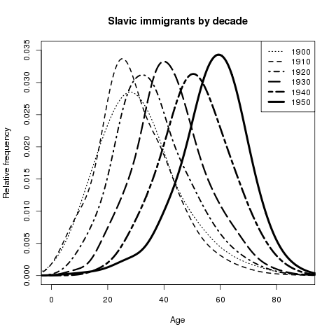
Rplot001-2

Figure 1.

Unfortunately, this chart does not show me the distribution of immigrants that actually immigrated between census years (rather illustrates the distributions of living immigrants arriving before a given year). Fortunately, the variable I constructed that estimates the amount of time spent in America (see Data and methodology) allows me to filter the data for each census to only immigrants that had arrived within the previous decade. Doing so for the 1890’s and 1900’s (using the 1900 and 1910 censuses, respectively), I find that the age makeup of immigrants in the two periods was fairly constant. As shown in figure 2, much more Slavic immigration occurred in the 1900’s than the 1890’s. As a result of immigration by young men in the 1900’s, the mean age of those immigrating in the decade decreased by  ~2 years (see spread between horizontal lines, Figure 2).

Figure 2.

In contrast, I may choose to look at the change in the age of Slavic immigrants arriving in the 1920’s, comparing this to those who had arrived in the 1900’s (Figure 3). As suspected, the mean  age of immigrants shot up by ~12 years (see horizontal lines). However, my suspicion that this was due to decreased immigration was not correct; Slavic immigration has dramatically increased. Instead, I find that the men and women moving to America during these decades were significantly older, implying the migration of full families rather than young single laborers searching for better work.
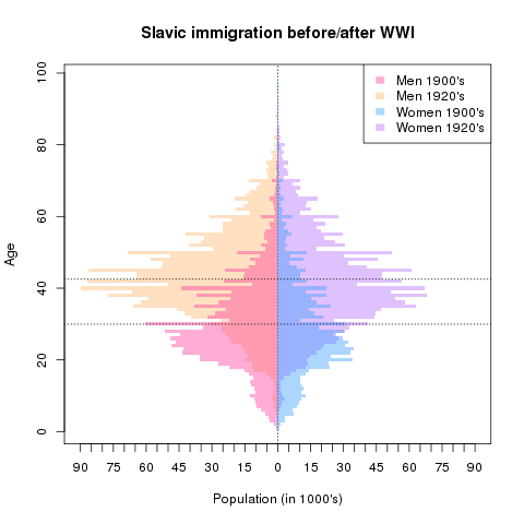
Figure 3.

Unfortunately the removal of the year of immigration question in the 1940 census means I cannot directly compare the 1920’s boom to the subsequent shock resulting from the Great Depression and WWII. Instead of observing immigrants arriving within a decade, I consider changes in the immigrant population between years, at each age. Figure 4 illustrates precisely this. In contrast to my previous comparison, the ~18 year increase in mean age indeed appears to be due in part to reduced immigration. Note that the population of older individuals increases by far less than the population loss of young immigrants.  Barring a significantly increase in mortality rate, this is consistent with the immigration restrictions and repatriation discussed in the aforementioned research. The 1924 National Origin Act is one restriction that may be most responsible for what we see in Figure 4.

This act, aiming to preserve American racial homogeny, limited the number of people that could immigrate from a given country to 2% of the number of people from that country already in America by 1890. By doing so, President Coolidge and backers of the bill hoped to stem the flow of Southern and Eastern Europeans, among other groups.
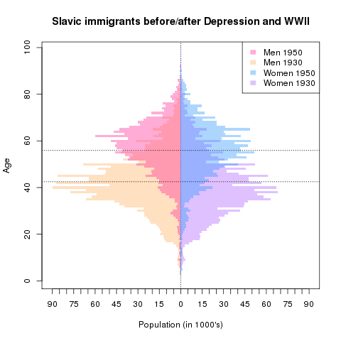
Figure 4.

Figure 5 is analogous to Figure 1, except that it considers second generation immigrants by year. Note the flattening of relative frequency curves. Given that older first generation immigrants are likely to have children with a broader range of ages, the flattening of the curves and increase in mean age is expected on the basis of biology and mathematics.
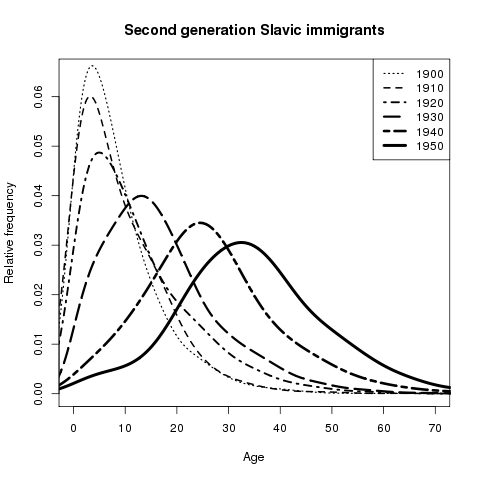
Rplot002-1

Figure 5.

However, all relative frequency kernel diagrams fail to show me how a total population has changed from year to year. In order to investigate this metric for a span of time (1930-1950) and I create a synthetic cohort of individuals that would be between the ages of 0 and 19 in 1930. By shifting the range of ages included by 10 years for every census, I are able to track the same age cohort across time. I choose to employ a truncated population pyramid in oder to display this population information, as shown in Figure 6.
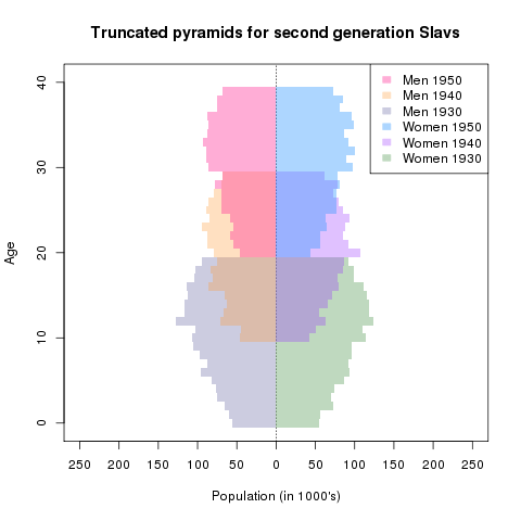
Figure 6.

Figure 6 supports the conclusions I drew from Figure 4, as is evident in the shrinking of successive pyramids. The ostensible disappearance of first generation immigrants between 1930 and 1950 is likely the result of emigration on a family level, which is why their (probable) children are leaving with them. Alternatively this disappearance may have occurred due to war casualties, or it may have only occurred “on paper” if racist attitudes and McCarthyism simply led to fewer individuals admitting to foreign links on the census (Roediger 2005, 134).

Unfortunately I cannot differentiate between  these “paper losses” and genuine emigration, but I can investigate whether or not the change is due to the war by comparing second generation immigrants to native born Americans of the same age cohorts.

In Figure 7, I do just that. By matching the 0-19 years-of-age cohorts in 1930 to the 20-39 years-of-age cohorts in 1950, I can estimate the proportion of individuals accounted for in both census that were less than 20 years old in 1930. If I stratify this analysis across by second generation Slavic status, I find that for non-Slavs, virtually all people can be accounted for. In contrast, only ~80% of second generation Slavs are captured in the second census. If this ~20% loss was the result of war or death, I would expect similar amounts of native-born Americans to go missing. Consequently, there must be some heterogenous effect, be it reverse migration (as theorized) or an unwillingness to recognize one’s ancestry.

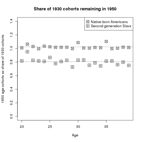
One should note that the questionnaire text did not change radically between these years. In 1930, the census asked:

Place of birth of each person enumerated and of his or her parents. If born in the United States, give the State or Territory. If of foreign birth, give country in which birthplace is now situated. Distinguish Canada-French from Canada-English, and Irish Free State from Northern Ireland.

In 1950, it asked:

25. What country were his father and mother born in? (Enter US or name of Territory, possession, or foreign country)

Clearly, the difference is not due to a change in the nature of what is being asked. Further data on emigration would be incredibly valuable in explaining this fairly dramatic result.

Conclusion

In short, the fifty year story of Slavic immigration and identity in the early 20th century is one with many chapters. Towards the tail end of the Second Industrial Revolution, age distributions behave in precisely the way I expect them, given the literature explored. The conclusion of the first World War prompts massive waves of migration of families searching for a better life. This scenario does not repeat itself at the conclusion of the second World War, likely as a result of the counter-effect of the Great Depression and restrictive immigration policy. It is plausible that McCarthyism and racist attitudes may also have led to the dramatic disappearance of Slavic immigrants after the war.

Sources

Source code for analysis and figures

Gregory, James N. The Southern Diaspora: How the Great Migrations of Black and White Southerners Transformed America. Chapel Hill: University of North Carolina Press. 2005. Print.

Jacobson, Matthew Frye. Barbarian Virtues: The United States Encounters Foreign Peoples at Home and Abroad, 1876-1917. New York: Hill and Wang, 2000. Print.

Roediger, David R. Working toward Whiteness: How America’s Immigrants Became White: The Strange Journey from Ellis Island to the Suburbs. New York: Basic, 2005. Print.

Ruggles, Steven,  Katie Genadek, Ronald Goeken, Josiah Grover, and Matthew Sobek.Integrated Public Use Microdata Series: Version 6.0 [Machine-readable database].Minneapolis: University of Minnesota, 2015.

Children of Divorce 1940-2000

Introduction

It is common to hear the statistic that “fifty percent of marriages will end in divorce.” The fact is, divorce is quite common in the present day. In this post, I explore two questions. First, I look at how the presence of divorce among families with children changes over time. Second, I look at how divorce differs based on child age and race. Because divorce deeply affects children, I frame my analysis at the individual child level. In other words, I look at how the number of children living with divorced parents changes over time. I believe it is more impactful to do individual-level analysis, as opposed to household-level analysis, because in doing so, I gain a better understanding of the number of children affected by divorce.

Data

In order to analyze the changes in the number and percent of children living with at least one divorced parent, I use Integrated Public-Use Microdata Series (IPUMS) 1% samples from 1940-2000. For the 1970 data, I use the 1% State Form 1 sample, and for the 1980 data, I use the 1% metro sample.

In my analysis, I include all individuals between ages 0 and 17, using the IPUMS variable AGE. I include these ages because children in this age range are likely to still be living at home with their parents. Since most kids leave home at the age of 18, a large portion of that age would be lost from my sample because they would not be living with a parent. Therefore, I do not include people who were 18 at the time of each census.

I only include households with fewer than 5 unrelated people living there (IPUMS variable GQ = 1). All analysis are weighted by the IPUMS variable PERWT.

Methods

To match a child to the parent(s) with which he or she is living, I use the IPUMS pointers MOMLOC and POPLOC. These variables are constructed by IPUMS to locate an individual’s mother and father person number within the household (Ruggles 1995, 52). Using the variable MARST, I check to see if either parent the child lives with is currently divorced (MARST = 4). If a child lives alone, or with no parents, I count them as not living with a divorced parent. If a child only lives with one parent, I see if that parent is divorced, and if so, I count that child as living with a divorced parent. In other words, the child needs to be living with at least one divorced parent to count in the “divorced” category. Most children living with a divorced parent do not live in two-parent households. More specifically, they are more likely to be living with their mother because  a “predominant pattern of mother custody” during this time period (Goldscheider 2001, 489)

Because I only observe if the adult is currently divorced, I do not count adults who are remarried as divorced. A child could live with his father and his step-mother, and although the father was once divorced from the child’s biological mother, this child would not be counted as living with a divorced parent. Therefore, my estimations of the number of children living with divorced parents are likely underestimates of the true number.

It is important to note that I am not counting the number of divorces over time. Because I am looking at the data at the individual child level, it is possible, and quite likely, that one divorce results in multiple children living with a divorced parent. If a parent has multiple children at the time of his or her divorce, all of those children would be counted as separate observations in my data.

In my analysis, I first look at time trends in the data. I observe the number of children living with at least one divorced parent between 1940 and 2000. Because the population of the United States grows over that time period, and fertility changes over time, I also look at the percent of children ages 0-17 living with a divorced parent over time.

After gaining a general understanding of how the number of children of divorce change over my time period of interest, I break the data down by race and age to see if the trends differ across these variables. I separate all individuals into two race categories: white and non-white. The non-white category includes Hispanic people (HISPAN = 1), and the while category includes all individuals listed as white on the census (RACE = 1), besides the Hispanic population. I also broke down my data into three even age groups: ages 0-5, 6-11, and 12-17. I chose these age groups because I wanted each category to contain the same number of ages, which is six years in this case. I would expect to see more divorces as a child ages, because parents of young children are more likely to still be married than parents who have been together longer, and have not recently had children.

The R code I used to generate the results below can be found here.

Results

Figure 1 shows the number of children living with a divorced parent in the United States between 1940 and 2000. As the figure shows, there is a steady increase between 1940 and 1960. Between 1960 and 1980, the number of divorces doubles in each census year. After 1980, the number of divorces increases at a slower rate. Figure 2 shows the percent of children living with divorced parents from 1940 to 2000. The trends shown in Figure 2 are nearly identical to Figure 1, which implies that children of divorce grew as a total proportion of children over this time period. In 1940, only around 2% of children lived with a divorced parent. In 2000, that figure reached almost 15%.

These patterns could have several explanations. First, the social emphasis on the nuclear family peaked in the 1950’s. Since then, there is much less of a social stigma associated with getting divorced. Second, there could be external factors compelling couples to divorce in the latter half of the century. Tamara Hareven attributes these family “breakdowns” to pressures of urban life or migration, both of which increase after 1950 (Hareven 1974, 325).


Figure 1:

NumKids

Figure 2:

PercKids

Figures 3 shows how the number of children living with a divorced parent changes from 1940 to 2000, broken down by age group and race. For both white and non-white children, the number of children living with a divorced parent increases as the child ages. This implies that as more time passes, a couple is more likely to divorce, which makes sense. This also means that during a typical childhood, more children see their parents divorce than remarry.  For white children, there is a much larger gap between the age groups. This means that, on average, white parents who divorce tend to divorce when the child is older compared to non-white parents. Non-white parents are more likely to divorce when the child is younger, stay together, or remarry. Steven Ruggles argues that black children are more likely to live in single parent households due to their disadvantaged position in society (Ruggles 1994, 136). This is also likely the case for non-black minority races in the United States. Socioeconomic disadvantages could be what is driving the race differences regarding divorces.

Figures 4 shows how the percent of children living with a divorced parent changes from 1940 to 2000, broken down by age group and race. Most of the trends are the same as Figure 3. Interestingly, however, there has been a decrease in the percent of children living with at least one divorced parent for non-white children between 1990 and 2000, which is the opposite of the general trend in more children living in divorced households. This could suggest that the factors causing non-white couples to divorce have a smaller impact in recent years.

Figure 3:

NumKidsRaceAge

Figure 4:

PercKidsRaceAge

Conclusion

The decision for a couple to divorce impacts more than the couple. If the husband and wife have children, the entire family is affected by this decision. In this post, I estimated the number of children ages 0 to 17 affected by divorce in the United States between 1940 and 2000. I find that across both white and non-white races, the percent of children who experience divorce in their lifetimes increases over this time period. I attribute this primarily to the social pressure to stay together in the earlier part of this time period. In the 1940s and 1950s, families felt huge pressures to remain together due to the social emphasis on the nuclear family. Over time, however, women have gained more independence, and the pressure to maintain the nuclear families has decreased significantly. Marriage length also increases as life expectancy increases, so the chances of divorcing increases over a longer marriage because there is a much longer time period to stick out an unhealthy relationship. Whatever the reason for an increase in the presence of divorce, I show in this analysis that over time, more and more children are affected by the dissolution of a marriage.

Works Cited

  • Hareven, T. K. “The Family as Process: The Historical Study of the Family Cycle.” Journal of Social History 7.3 (1974): 322-29. Web.
  • Goldscheider, Frances K., Dennis Hogan, and Regina Bures. “A Century (plus) of Parenthood.” The History of the Family 6.4 (2001): 477-94. Web.
  • Ruggles, Steven. “Family Interrelationships.” Historical Methods 28.1 (1995): 52-58. Print.
  • Ruggles, Steven. “The Origins of African-American Family Structure.” American Sociological Review 59.1 (1994): 136-48. Web.

Biracial heritage in the 1900’s

Discrete categorization of race and ethnicity creates a myriad of issues (Omi and Winant 1986, 105). One such challenge, experienced by Americans of mixed heritage, consists of distilling a multi-faceted background into a single dimension for the purposes of the Census (Hochschild 2008, 60). Although the two most recent iterations of the Census have allowed respondents to claim multiple racial identities, respondents in the early twentieth century did not have this option. Moreover America’s problematic history of racial classification, particularly with respect to black Americans (evident Jim Crow laws and other policies tied to the one-drop rule), leaves black-white biracial Census respondents with a particularly unique choice when it comes time to report their racial identities. I use census microdata from the IPUMS-USA project in order to examine how responses to this choice have varied over time and across regions.

Scholarly background

Documenting the racial identity of mixed heritage persons has posed a challenge for the Census Bureau since the first census that collected individual-level data (in 1850). As part of this census, enumerators were required to collect information on an individual’s status as a mulatto (Hochschild 2008, 67). The academic popularity of race science led to the inclusion of quadroon and octoroon categories in the 1890 census (Hochschild 2008, 68), representing lesser degrees of “black blood”. Without any information on an individual’s family history, enumerators were expected to provide the Bureau with their best guess for individuals of suspected mixed ancestry (ibid.)

Data and methods

In order to examine the historical classification of black-white biracial Americans over the course of the 20th century, I turned to the Integrated Public-Use Microdata Series, using census samples from 1920 through 1980. For 1930, I used the 5% sample; for 1970, I used the 1% State Form 1 sample; for 1980, I used the 5% state sample; and for all other years, I used the 1% sample provided by IPUMS.

It should be noted that I did not initially intend to focus on children. Nevertheless, this scope was chosen because it would be not be possible to otherwise determine who is of mixed heritage; the racial identity of a respondent’s parents is never asked by the Census. Insofar as a child’s racial identity later in life is correlated with the race declaration that their parents choose for them, any findings from this investigation will apply to the populace at large.

In order to identify the relevant population, I filtered the data set for non-hispanic black and white children living with a both non-hispanic black or white parents. For the sake of this analysis, the 1920 black classification includes those termed mulatto. This group does not represent a significant portion of the black children or parents analyzed for that year. Beyond year, racial classification as black or white is not broken down into any other subgroups; we are left to largely take these binary variables at face value, caveating with any significant changes in the questionnaire. Although the data set was filtered to only include biological children of the household head, a biological link between a head’s spouse and a head’s child was assumed for the sake of this analysis. Similarly, inconstancy in the use of the ‘partner’ relationship in census responses did not allow me to use that information to infer parentage.

With the appropriate subset of individual responses, it was possible for me to classify children by the race declaration of either implied parent and by a child’s own classification on the census. The subset for which implied parents are of different races is most relevant to my analysis.

Given this subset, other characteristics, such as the region in which a family lives, and a child’s sex or age, allow me to further stratify the data. Indeed, all of the results were generated simply by plotting the summed person weights of various cohorts against the year in which the census was taken. Although the later age and sex stratification did not reveal anything noteworthy, the region in which a biracial child lives appeared to influence the likelihood with which a parent will declare them to be either black or white.

All of the conclusions that follow assume that any physical factors that might play a role in the determination of racial identity, such as skin tone or the number of grandparents a child has of either race, do not change dramatically vary by year for the average biracial child. This allows us to limit discussion of potential explanations to those that are indeed more plausible.

Results

Before drawing any conclusions about biracial children, I might choose to consider the population of children by race category. For the sake of clarity, the reference group consists of the children of same race parents. As is evident in Figure 1,  the ratio of white to black children reported does not differ dramatically from year to year. Black children represent 8% to 10% of ‘same race parent’ children, with the slight uptick taking place in 1970 and 1980.

Rplot001-1

Figure 1.

An analogous chart was generated for the population of children in the biracial cohort (Figure 2). One of the most striking features of this chart is the significant increase in the total number of biracial children in 1940. Given that this classification is generated on the basis of a difference in parental race declaration, it is plausibly the result of an increase in actual (or reported) interracial marriages rather than a change in questionnaire instructions. Alternatively, it may simply reflect an uptick in the number of interracial families that are able to stay together. That is to say, any change in classification methodology probably did not have a different effect on a respondent and his/her spouse; therefore an increase in couples is probably not the result of questionnaire syntax.

Rplot002

Figure 2.

It is difficult to establish a causal link for this jump, in light of the fact that most state anti-miscegenation laws were not challenged until after WWII. Indeed Loving v. Virginia, which ruled such laws unconstitutional, was not decided until 1967. Moreover the fact that more than half of the children represented in this year lived in the South (Figure 3),  undermines the possibility that the uptick is the result of changing social attitudes in areas where interracial relationships were not restricted or frowned upon. Indeed, Figure 3 shows that from 1930 to 1960, a very large proportion of biracial children lived in the South, suggesting that in spite of segregation and other divisive policies, many of America’s biracial children were born to families in this part of the country.

Rplot003

Figure 3.

Taking a look at the racial declaration of these children (Figure 4), I find that about 65% of the time, the child of different race parents would be reported classified as black. The widths of the columns in this figure (and in Figure 5) are proportional to the number of biracial children observed within each respective geography for a given year. There do not appear to be any consistent trends with respect to the population of biracial children nor is there a clear change with respect to the rates of race declaration. One might assume that the method by which enumerators and parents have made this judgement has not changed significantly over time. Turning to Figure 5, I see a start contrast.

Figure 4.

Figure 5 shows the probability with which the biracial child of a white census household head  (typically male) would be declared either black or white for census purposes. It should be noted that the instructions given to enumerators for early census years was to assume that biological children are of the same race as the household head. This instruction (if followed) would suggest an overwhelming probability of being declared white for those years. Conversely, the one drop rule would imply an overwhelming probability of being declared black whenever applied. In reality, neither of these rules can wholly explain the heterogeneity that I see. In 1960 onward, the shift to mail back questionnaires led to

Rplot005

Figure 5.

Through the 1950’s, the probability of being declared white increased, to a peak of ~45% (equivalent to the average probability of being declared white for all years in the South). Since then, this probability has consistently declined, almost halving by 1980. The trend among back census respondents had the same profile and otherwise only differed in being noisier. Again, it is difficult to infer any kind of causality, but the inflection point does appear to roughly coincide with the civil rights movement. Perhaps the perceived benefits of checking one box over the other have declined, or black empowerment has resulted in people viewing their identities (and those of their children) differently. Without more granular data on individual racial identities (i.e. whether or not someone has previously checked a different box) it is not feasible to draw a causal link between the trends I observe  and the aforementioned movement.

Figure 6.

Figure 6.

Addendum: In considering Figures 4 and 5, I decided to take a closer look at the counterpart to Figure 4 for the non-South. Perhaps unsurprisingly, it reflects a similar trend to the one illustrated in Figure 5, but at a more extreme level (that is not tempered by Southern data). It appear to support the notion that same notion that the desirability of the white checkbox has diminished with respect to its counterpart. The mechanisms behind this likely do not differ between America overall and the non-South in specific.

Conclusion

The probability that a biracial child is categorized as black or white is more complicated than a simple coin toss, or than any enumerator instructions would imply. Although children in the South have consistently had a relatively high (and constant) probability of being declared white, the data reveal a national trend in the other direction. As discussed earlier, multiple factors likely bolstered this trend. Changes in enumerator instructions influenced the way biracial children would be classified in the early part of the century. The switch to the mail back census in 1960 and 1970 likely led to more autonomy in how the children of householders were classified by their parents. The direction of this effect was likely dictated by the growing sense of racial identity that grew out of the civil rights movement.

Sources

Source code for graphs

Hochschild, Jennifer and Brenna Marea Powell. “Racial Reorganization and theUnited States Census 1850–1930: Mulattoes, Half-Breeds, Mixed Parentage, Hindoos, and the Mexican Race”, Studies in American Political Development. 2008; 22(1): 59-96. Print.

Omi, Michael, and Howard Winant. Racial Formation in the United States: From the 1960s to the 1980s. New York: Routledge & Kegan Paul, 1986. Print.

Ruggles, Steven,  Katie Genadek, Ronald Goeken, Josiah Grover, and Matthew Sobek. Integrated Public Use Microdata Series: Version 6.0 [Machine-readable database]. Minneapolis: University of Minnesota, 2015.