Contrast Helps Viewers Move Through the Gallery and Analyze the Paintings
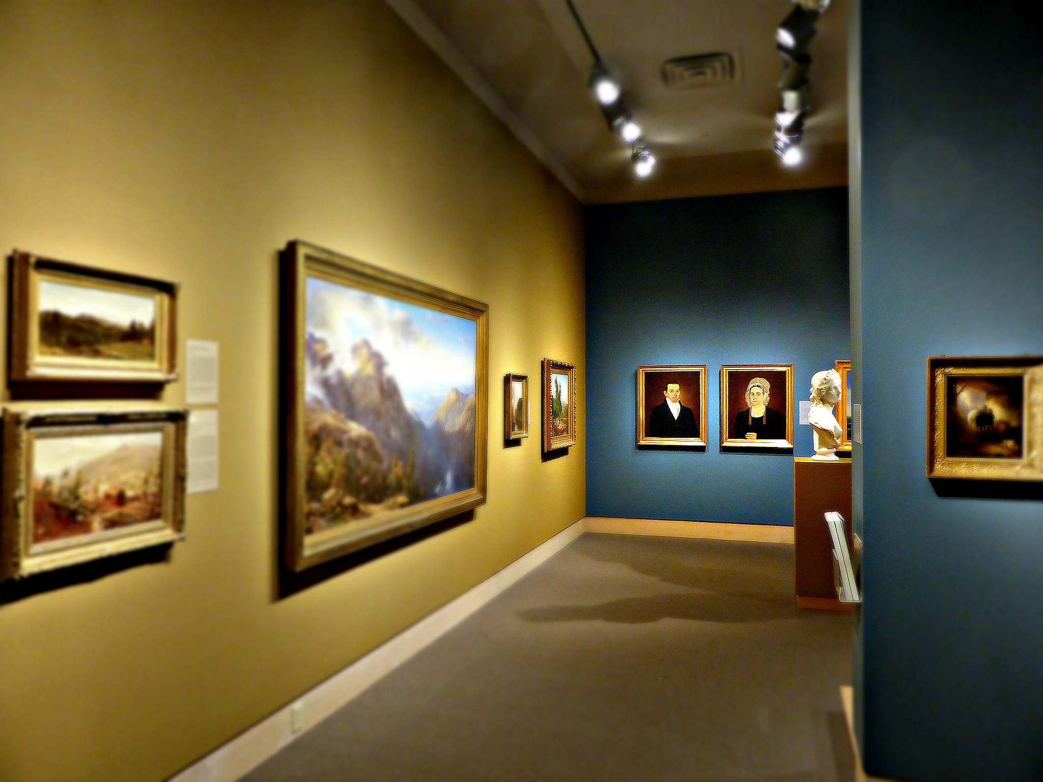
The Isaac Sack Gallery uses different types of contrast to its full advantage to create a sense of movement throughout the room and emphasize certain features of its collection. The nature of the colors and the arrangement of the paintings provide multiple different types of contrast. David Dernie views coloristic contrast as being a key element of creating a viewing experience for a museum-goer (Dernie 160), a technique used extensively in this gallery. The two colors adorning the walls, dark blue and tan-yellow, contrast innately. In color theory, these two colors are complementary, meaning that when juxtaposed, they pop.
Movement is created through this contrast because of the clear path that the dark blue coloring follows. The side of the central structure facing the entrance is blue, which then leads the eye to either of the walls flanking the entryway. The view is then directed toward the center structure in the room, and subsequently the back wall of the room, which then leads back to the front in a similar fashion as before. Artistically, this draws the viewer's eye along a route from the front of the gallery around the structure in the middle to the back, similar to the effects of a river in a landscape painting drawing a viewer's eye from the foreground to the middle ground to the background. People tend to follow where their eyes are going, so that outlines a route through the gallery for the viewers. A similar route is created through the yellow, leading from one side wall around the back of the central structure to the other side wall. This mirrors the two-lap viewing route that is encouraged by the structure of the gallery.
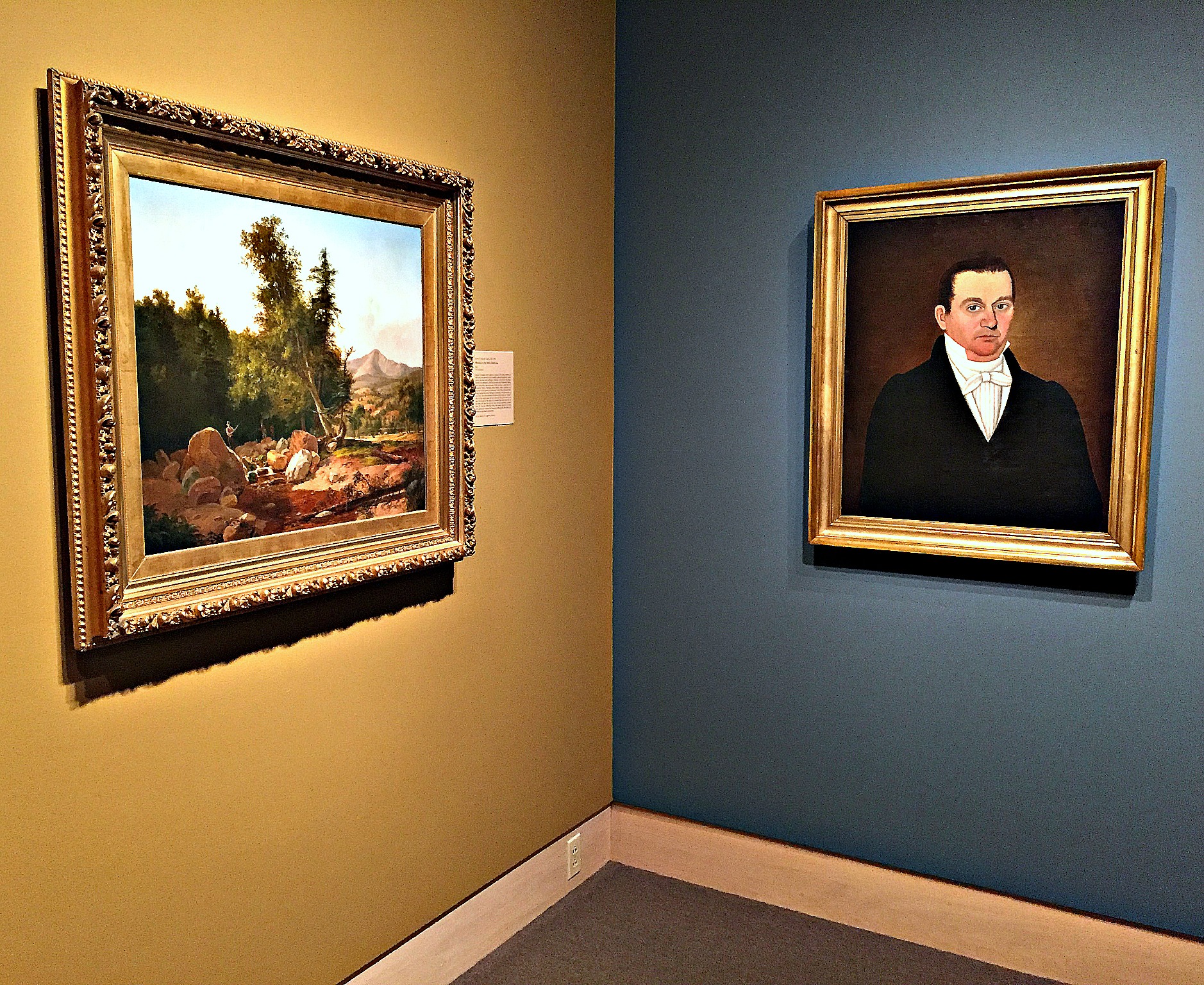
The gallery also makes use of pictorial contrast to keep viewers interested in the art. The paintings on the yellow walls consist almost exclusively of wide-view landscapes, and the paintings on the blue walls, while more varied, are generally cozier portraits or genre paintings. Combined with the movement of the viewer through the room, the artwork provides a varied (but patterned) order that allow viewers to compare paintings of a similar genre at once, before moving on to another genre. The viewer is thus encouraged to spend more time with the paintings, thinking about how groups of paintings are similar or different.
Because of how contrasting colors and subject matters are used, the viewing experience is shaped to create a natural movement for the viewer and allows for a more in-depth view of the art displays. If the contrast were not present, the viewers would have likely not engaged as deeply with the paintings, regardless of the artistic prowess of the painter.