For this project, I challenged myself to think outside of the box. Or, at least, redefine the box. I wanted to reshape it. In the end, I the shape I chose was that of the human body.

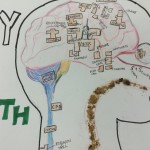


By setting my map within the shape of a human anatomy diagram, my rhetorical focus shifted from geographical accuracy to symbolism. In the “How to Look at a Map” chapter of James Elkins’ Your Eyes, Elkins discusses an old Buddhist map. The cartographer, he explains, used symbolism in that he showed the islands perceived to be inferior as cracking off of the “egg” of the Southern Continent (Elkins 127). Similarly, I wanted my map to be representational, to convey meaning about different places on the Dartmouth campus. “Where” became less important than “what.” My map thus echoes the “unorthodox arrangement” (Elkins 126) of pre-modern maps, unbound by latitude and longitude. To me, this lack of rigidity actually complements what I envision the purpose of my map of Dartmouth to be. I wanted my map to provide a new and interesting way to think about Dartmouth spaces.
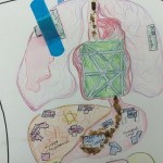
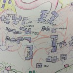
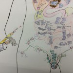
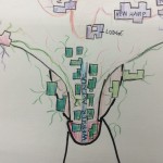
Specifically, I chose to draw different sections of and buildings on campus within specific parts of the human body in order to represent the functions of those spaces (based on the functions of the corresponding body parts). The brain, knowledge center, houses the academic buildings, while the brain stem, which supports the nervous system, contains the major support centers on campus, form the Center of Professional Development to Carson, where the Undergraduate Deans’ offices are located. The stomach contains all of the places to eat on campus, the liver, the part of the body responsible for eliminating toxins, is where I drew the religiously affiliated buildings, and the digestive system is where I put all of the residential buildings, because to me, dorms are where students go to process their days and digest what they learned. The green is the heart because I see it as the heart of campus, the fraternities located on the male genitalia to show that they are male-dominated spaces. And so on.
I obviously sacrificed cartographical practicality for creativity. In the words of Elkins, “the map is a compromise, like any map” (128). My map would not be incredibly useful to someone who’s never been to Dartmouth and is trying to find his or her way around. Again, though not accurately scaled, my map is as accurate as possible within the reach of the theme I chose. For example, all of the academic buildings on campus happen to be located pretty close to one another and north of the green, and so when I drew them in the brain, I transposed the exact shapes of the buildings and their locations relative to one another. The Hop and the gym are still to the right of the green, Thayer and Tuck still to the left. Although all of the residence halls are not located south of the green in actuality, within the digestive tract on my map, I placed them with respect to one another according to their relative positions on campus. I tried to preserve as much spatial accuracy as possible after grouping each type of space.
Despite its limitations, I feel that the unique interpretation, bright colors, and use of as much multimodality as I could think to incorporate (I placed Foco cookie crumbs along the esophageal pathway leading into the stomach, spilled some left over cough medicine I got from Dick’s House in the lungs, where I decided to locate the medical institutions, etc), helped make my map literally “come alive.” I had a lot of fun with this project (almost as much as the amount of time I spent drawing it 😉 )