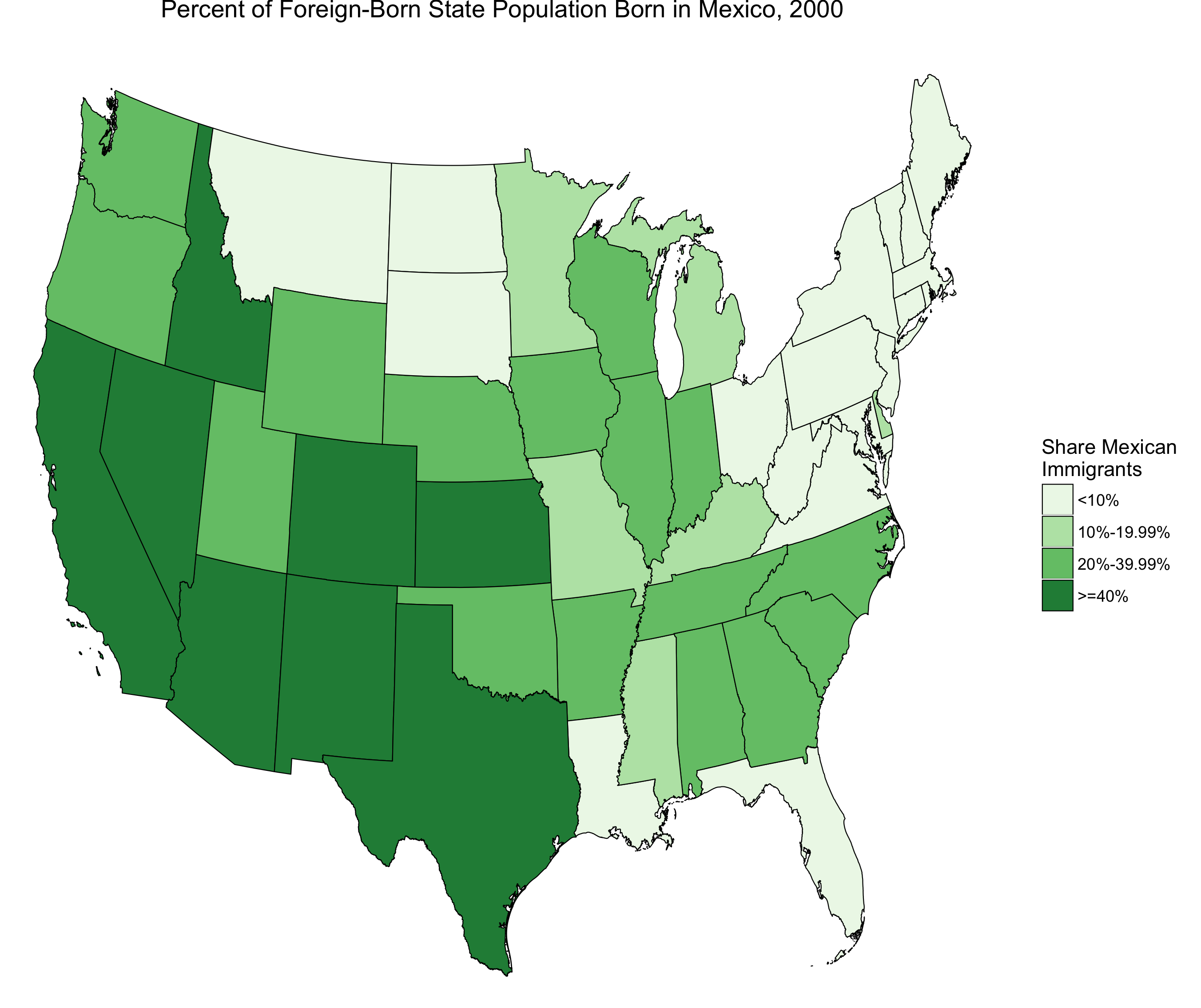
Immigration has been the focus of many political debates and governmental laws. Around the middle of the 19th century, “Every branch of the federal government and many state and local governments became embroiled in ideological debates around immigration-as did the Census Office” (Hochschild and Powell, 2008, 75). Americans felt threatened by the rising number of immigrants for many reasons and engaged in prejudice behavior against immigrants. Some believed that the native born white population, the dominant race/societal class, was decreasing due do the incoming foreigners taking up space (Hochschild and Powell, 2008, 75). There were concerns about wether or not these new immigrants had the virtues necessary to participate in the American democratic society (Jacobson, 2000, 69). Even more, American workers were outraged that immigrant workers were taking their jobs (Jacobson, 2008, 69). All of these factors and more resulted in extreme tension regarding immigration in the early 20th century. This tension led to action from the government in the form of the Immigration Act of 1924. The Immigration Act of 1924 “restricted immigration into the United States to 150,000 a year based on quotas, which were to be allotted to countries in the same proportion that the American people traced their origins to those countries, through immigration or the immigration of their forebears (Ngai, 1999, 67). This post focuses on levels on immigration from certain countries in the 20th century and how the Immigration Act of 1924 affected those levels.
Data
I gathered data from the Integrated Public-Use Microdata Series (IPUMS) for this project. I used 1% data samples from the 1900-1960 censuses and took the BPL (Birthplace), SEX, and PERWT variables from these samples. The PERWT variable represents the sample weight of each individual. The BPL variable indicates the birthplace of the individual. I grouped the BPL variable into these categories: U.S. Born, Other North American, Central and South America (Includes Mexico and the Caribbean), Northern Europe, United Kingdom & Ireland, Western EU, Central/Eastern EU, East Asia (Includes China, Japan and Korea), Other Asia, and Other.
Methods
I graph the population of the United States by gender and birthplace from 1900-1960 in order to see how immigration levels change over this period. I graphed immigration levels before and after the Immigration Act of 1924 in so that I could see how much of an impact it had on immigration. I chose to include the U.S. Born category for two of my graphs in order to view the overall influence of immigrants on the U.S. population. I graphed the total population to see which birthplace groups most increased population over this time and the population as percentages to better see which birthplace groups gained or lost a presence in the U.S. population over time. I then created two more graphs without the U.S. Born variable in order to isolate the immigrant population in America. One graph illustrates the total numerical immigrant population over this period to show how overall immigrant levels changed over time. I graphed each birthplace category as a percent of the total immigrant population in order to demonstrate which categories were most affected by the Immigration Act of 1924. The code for this project can be found here.
Results
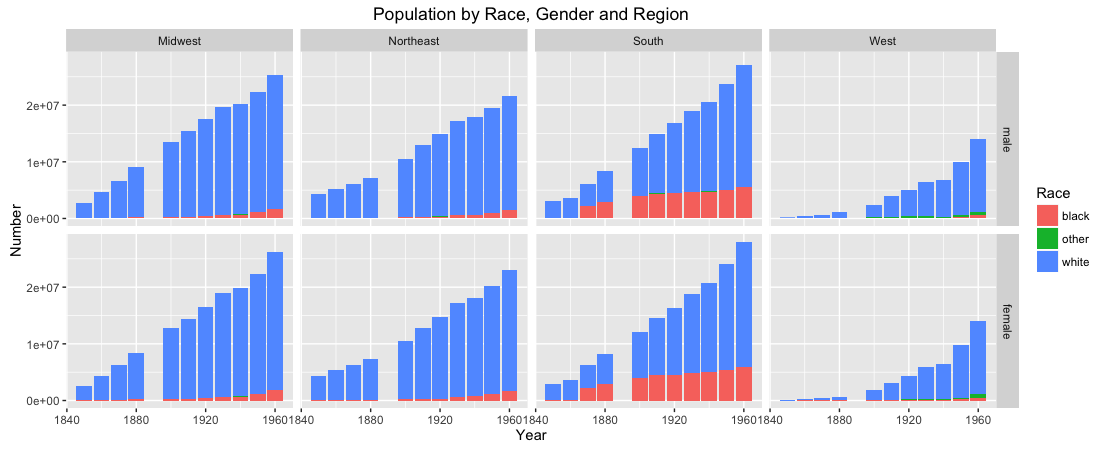
Figure 1:

Figure 1 represents the total population of the U.S. by birthplace and gender from 1900-1960. The increase in population is practically linear and can largely be attributed to the rise in the U.S. Born category between each census. There are slight changes in the immigrant population that can be seen on this graph, but they are significantly overshadowed by the U.S. Born population. The immigrant population, according to this figure, was a small fraction of the total U.S. population during this time. There is no noticeable difference between the male and female population in this figure as well.
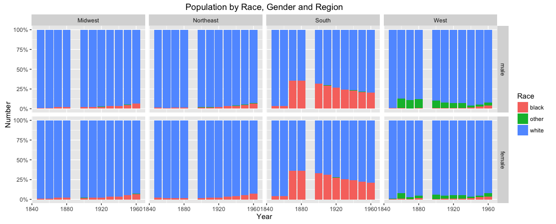
Figure 2:
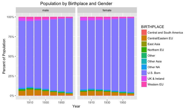
Figure 2, like figure 1, represents the total population of the U.S. by gender and birthplace but as percentages of the total rather than numerical values. This graph does not show how the total population increases, but it reveals which birthplace categories dominate the population. The U.S. Born birthplace category makes up about 80% of the total population in this graph. Like figure 1, it is difficult to see how specific immigrant groups changed in population over this time. What this graph does reveal is that the immigrant population, as a proportion of the total U.S. population, declines after the Immigration Act of 1924. The largest percentage of the population that immigrants hold is in the 1910 census. Immigration from all birthplace categories decreases during this part of the 20th century. Like figure 1, there is no significant variance between the male and female population here.
Figure 3:

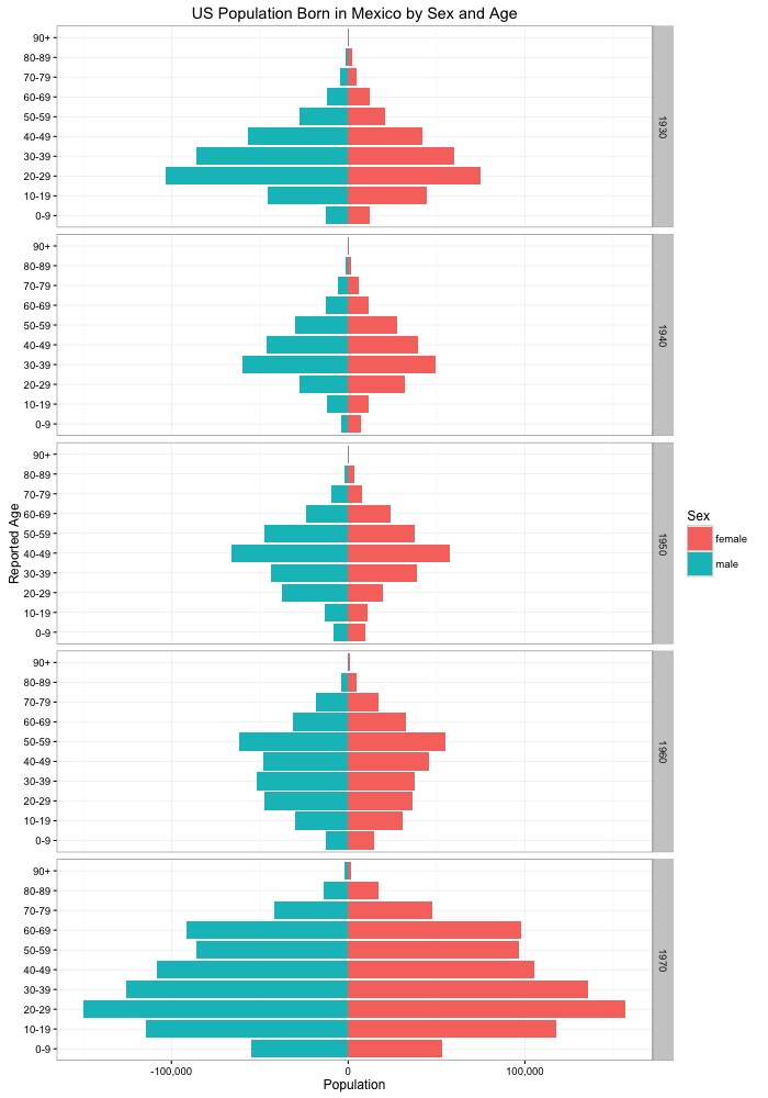
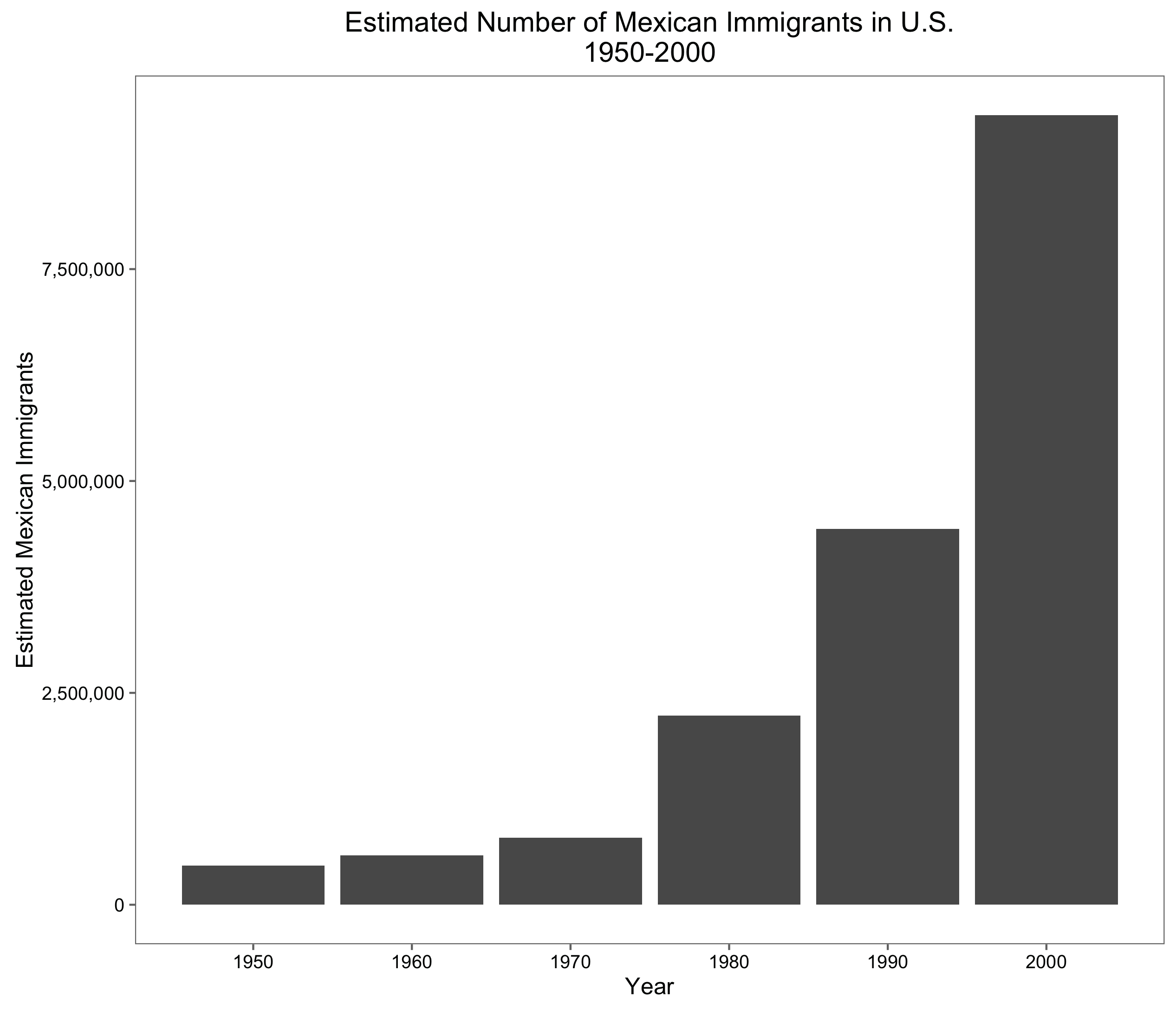
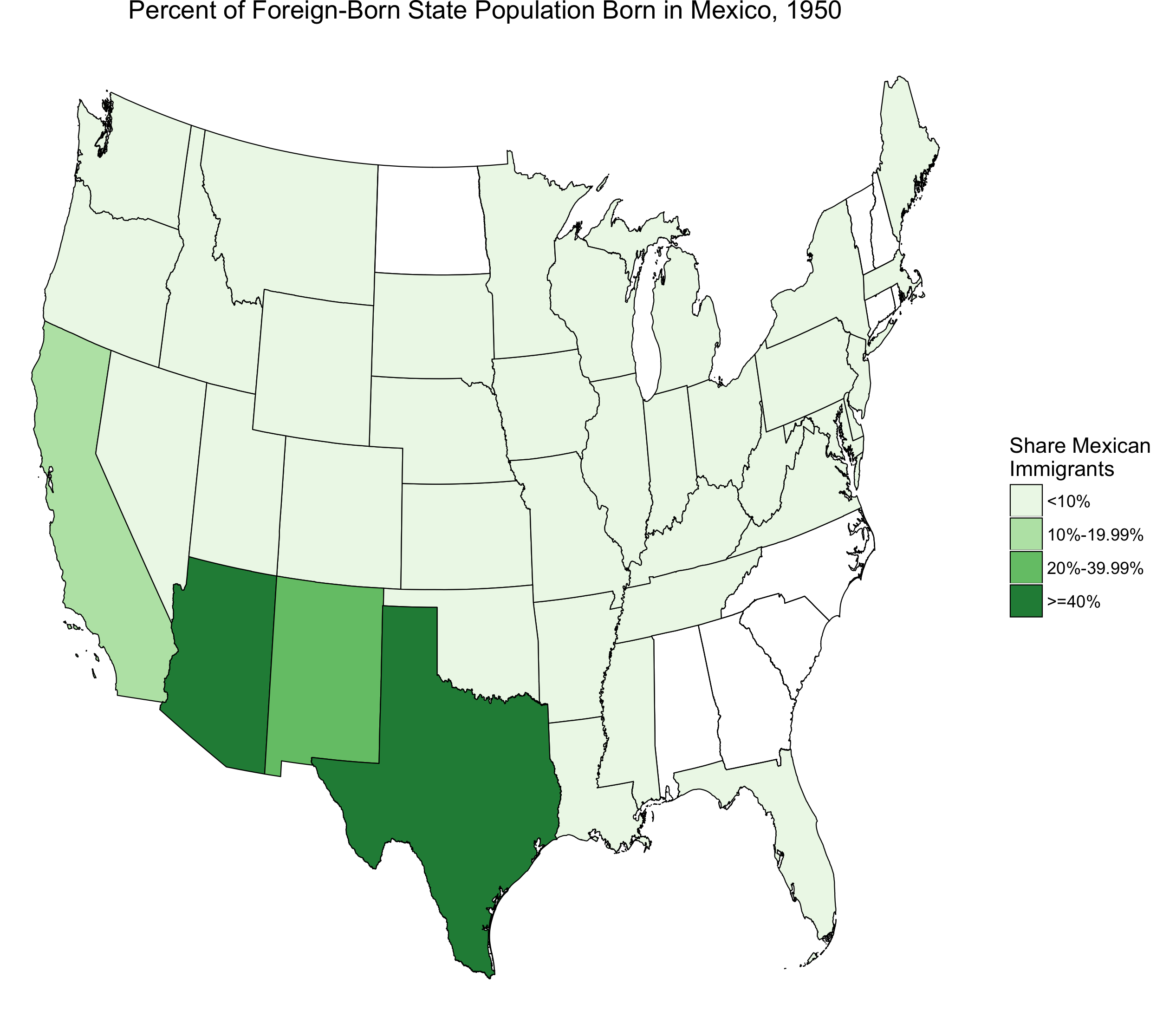
Figure 3 illustrates the numerical value of the total immigrant population in the U.S. from 1900-1960 by gender and birthplace. This graph shows a much more detailed portrait of how different immigrant groups changed in size during this period. Male immigrants outnumber female immigrants at the turn of the century and continue to until 1960. Both genders have a large jump in population from the 1900 to 1910 census, but afterwards the male population plateaus and the female population slightly rises over the next two decades. The 1930 census is the peak for each gender, followed by a sharp decrease over the following decades. The male population drops to a level that is lower than its initial 1900 number whereas the female population remains above its 1900 number. This indicates that restrictions placed on female immigrants could have been lesser than the restrictions placed on male immigrants. With regards to the separate birthplace categories, this graph shows a steadily decreasing number of immigrants from all parts of Europe and the UK & Ireland and an increase of persons from Central and South America. There is a drop in immigrants from Central and South America from 1930 to 1940, but the 1960 census indicates that this immigrant group re-populate to its former number.
Figure 4:

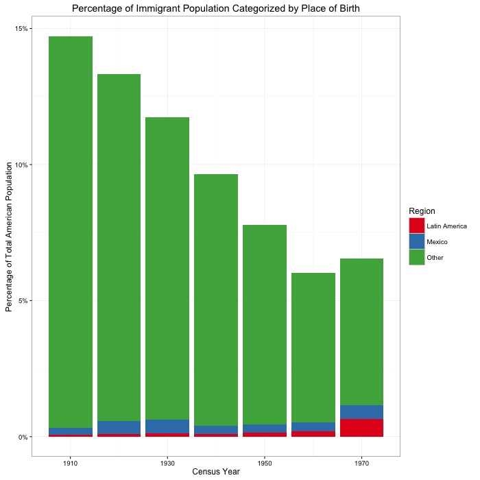
Figure 4 illustrates the percentage of the total immigrant population that each birthplace category had from 1900-1960 by gender. This graph indicates that there is a drop of representation in the immigrant population from all areas of Europe except for Western Europe. Western Europe ends up with a larger percentage of the total population in 1960 than it had in 1900. Categories of the immigrant population that increased as a percentage of the total population were Central and South America and Other NA.
Conclusions
These results show the effects that the industrial revolution, American prejudice against immigrants, and the Immigration Act of 1924 had on immigration levels. Figure 3 shows a rise in the immigrant population until 1930 when it rapidly decreases. I believe that this highlights the desire for immigrant labor held by factory heads and other employers of the industrial revolution. Along with this increase in immigrant population came strong prejudice against immigrants for reasons discussed above. Most of the prejudice came with a fear of Americans losing jobs and having the U.S. population diluted with foreigners. While it is true that immigrants were becoming a larger percentage of the total population, that percentage was still the significant minority. I think this indicates that some of the fears brought to the American government about immigrants were born mostly out of prejudice rather than legitimate concerns. As a direct result of these concerns, the Immigration Act of 1924 clearly did a great job of decreasing immigration levels to the U.S. But while it very clearly targeted specific immigrant groups (mostly in Europe), other foreign populations began to take their place like Mexican or Canadian immigrants. Lastly, it is striking how different the overall population of male and female immigrants varies over the course of this period. By 1960, the female immigrant population is greater than the male immigrant population, revealing how much opportunity has been made for women in this country. I also believe that this is an indicator of the growth of the role of women, specifically immigrant women, in the labor market. As certain industries developed, the need for both male and female immigrants became equal as displayed by figure 3. Immigration was clearly a highly controversial issue during the 20th century and continues to be one in modern times.
Works Cited
Hochschild, Jennifer L., and Brenna Marea Powell. “Racial Reorganization and the United States Census 1850–1930: Mulattoes, Half-Breeds, Mixed Parentage, Hindoos, and the Mexican Race.” Stud. in Am. Pol. Dev. Studies in American Political Development 22.01 (2008): 59-96. Print.
Jacobson, Matthew Frye. Barbarian Virtues: The United States Encounters Foreign Peoples at Home and Abroad, 1876-1917. New York: Hill and Wang, 2000. Print.